Creating your own speed limit map in QGIS and showing it interactively in Google Maps
Recently I showed you how to collect the speed limit data about the specified section of the road. It’s obviously a huge step toward the speed limit map preparation. Reading the last article you got to know some examples of beautiful and very useful speed limit maps. In this reading, you will get knowledge about the process of creating a map such as this.

Pic. 1 Speed limit map for the City of London (TFL/Ordnance Survey/Citymetric.com).
The speed limit map for London looks incredible, doesn’t it? It should be good to have your own map similar to this one. This article will definitely help you to prepare it. In the meantime, you will get to know a bit more about QGIS 3x, as I am going to show you how to:
– Create and edit a new spatiaLite layer
– Export the spatiaLite layer as the .shp file
– Amend the data attribute table (remove, add, and edit fields + fill up the values)
– Customize your values using the “Symbology” properties
– Prepare the .gpkg (geopackage) layer from your .shp file
– Export your QGIS work as the .kml file in order to display it on Google Earth and interactively (Google MyMaps).
Let’s get started then.
1. In order to start building up your own speed limit map, we should pick up the speed limit data first. The best platform to do so is Waze.com, where we can get this information. The full process explaining how to access the speed limit data about a certain road or road section has been explained in the last article.

Pic. 2 Highlighted street in Waze.com live map platform with the speed limit information provided.
2. Launch your QGIS and select the “Create layer” from the main toolbar, and next choose the “Create SpatiaLite layer” (Pic. 3). The process is exactly the same, as we do the map digitizing.

Pic. 3 Adding a new SpatialLite layer to our QGIS project.
Next, we must set all relevant details describing our new spatiaLite layer. These details will be stored in the data attribute table, which we are creating on our own right now (Pic. 4). The stuff needed for us is the street name and the speed limit value. We can alternatively put some IDs for ordering all these sections.

Pic. 4 Creating SpatiaLite layer in QGIS with all necessary options included: 1 – setting the new layer directory; 2 – Layer name; 3 – geometry type (line, when considering the roads); 4 – CRS (Coordinate Reference System) matching our QGIS project; 5 – Adding new field (further data attribute table column); 6 – defining the type of this new field (preferably integer for whole numbers and string for text); 7 – adding a new field to the Field list; 8 – Appending new field in the list (further data attribute table) after adding it 9 – Approoving by clicking the OK button.
Adding a new field is a very important step because we are already defining our data attribute table, where all relevant information about our layer will be included. It’s best to do it at the very beginning, not messing around later so I would advise you to be confident of your choice at this stage of work.
Besides the field options (further data attribute table) we have a multitude of other preferences to select (i.e. CRS, Geometry type, directory, etc.), which are as important as new fields. Make sure, that everything looks correct before you start plotting the layer into your QGIS project.
3. Your new spatiaLite layer should appear in the layer list window on the left side. If you don’t have this window dock opened, go to the “View” -> “Panels” and select “Layers”. I am assuming, that you have it opened as a default.
If everything is alright, click on this layer, make it active, and toggle the editor mode as per in the image below (Pic. 5).

Pic. 7 Preparing our new layer for the editing: 1 – our new layer visible in the layer list dock window on the left side of the screen; 2 – toggling the editing mode; 3 – switching on the “Add line feature”.
When you have toggled the “Editing mode” successfully, you can see the pencil icon overlapped with your layer signature. It means, that our layer is currently active for editing. Our next step is to switch on the “Add line feature” option, as we want to progress our layer. It will be needed throughout our entire work.
4. Now is the time for drawing our new layer. You will see the black circled crosshair. After clicking the layer will be created and you will see it in red color. Just carry on by clicking on the map, when following the road. Remember, that every single click creates a node for your line. When your work exceeds the map on your screen, you can simply toggle the “Pan Map” option (white thumb in your major toolbar) and drag the map toward the area you need to work on (Pic. 8). Remember to switch on the “Add line feature” afterward. You won’t lose your foregoing work, don’t worry 🙂

Pic. 8 Drawing a new line in QGIS, where: 1 – the drawing exercise with black rounded crosshair indicating the place where we are and the place where we want to create the new node by clicking on the map; 2 – the “Pan Map” option allowing us to drag the map when our work exceeds the map seen on the screen; 3 – The final stage of layer creation by right-clicking on the map. Here we are inputting the details for our data attribute table.
When you are done, just right-click on the map and fill up the pop-up window which should emerge instantly. This is the moment, where we are defining the details for every single object belonging to our layer. If you are sure, that everything has been filled correctly, then press OK. On the other hand bear in mind, that once you click the Escape (Esc) button, you will lose your entire foregoing work on the current element!
5. Your newly created layer with one element should be visible in default mode as the thin line (Pic. 9). You can now right-click on the “Properties” and select the “Open Attribute Table” in order to see how are things by now.

Pic. 9 Our first linear elements on our layer with all the information plotted by us and visible in the rows of the “Attribute table”.
6. Carry on your work, sticking to the advice above until you finish your entire area (Pic. 10).

Pic. 10 Our spatiaLite layer with a speed map is ready.
7. When you have done so, it would be nice to export our map into a .shp (Shapefile) format. It’s not necessary when you have everything right unless you have to change something in the data attribute table (I mean to add or remove some column).


Pic. 11-13 Exporting our spatiaLite layer into a .shp (Shapefile) file, where: 11 – selection option; 12 – “Export” dialog box, where we can set the geometry optionally (bounded red); 13 – new layer visible in our map canvas.
Exporting our spatiaLite speed limit layer as the .shp file is straightforward. We should remember the geometry option (Pic. 12) which in our case is LineString. The tool selects the “Automatic” option as the default.
Our saved .shp file should emerge both in the layer bar as well as on the map canvas (Pic. 13), having usually other colors than the existing spatiaLite layer, which now can be removed.
8. In case, when some alteration of our data attribute table is needed, we must open it and make the relevant changes (Pic. 14). They usually include removing unwanted columns and adding some new ones with the fill-up based on activating single elements included in our layer. Remember to toggle the editing mode at the very beginning!

Pic. 14 The example of data attribute table alteration in our shapefile, where: 1 – Selecting the “Data attribute table” by the mouse right-click.; 2 – Opening our “Data attribute table”; 3 – Toggling “Editing mode”; 4 – Selecting “Delete fields”; 5 – the “Delete fields” selection box; 6 – Selecting “New fields”; 7 – The “New field” input box with the text type “String” selected; 8 – The new column is already appearing in our data attribute table; 9 – Clicking (activating) and finding the element which data we want to change; 10 – The active element visible on our map as the yellow line with all nodes marked by red crosses; 11 – Changing the information in our data attribute table for this object.
Remember, that your feature can be updated only by clicking the leftmost ordering number as per in the screenshot below (Pic. 15).

Pic. 15 Activating the element in our data attribute table.
When you have finished your work, remember to save all the edits by clicking on the floppy disk icon (Pic. 16).

Pic. 16 The floppy disk icon indicating the “Save edits” option in our data attribute table in QGIS.
Another thing, you could want to do is change the name of our fields. It’s easily achievable when do right-click on our layer, then select the “Properties” and choose the “Fields” option. Next, we can select a field, which name we need to change by double-clicking on it. Since our cursor is inside the string, we can change it (Pic. 17).

Pic. 16 Changing the names of our fields in QGIS, where: 1 – Right-lick on our layer and the “Properties” selection; 2 – Toggling the editing mode (yellow pencil) and selecting the field name, which we want to change.
When everything is correct, click “Apply” and next “OK”.
9. Assuming, that you have finished work with the data attribute table or you didn’t have to fiddle with it, we can start to customize our map. Again, right-click on your layer and go to “Properties“, from where you enter the “Symbology” section. Next, at the very top, you must change the “Singly Symbol” to the “Categorized” option. At this moment, the tool will ask you about the “Value”, which comes from your data attribute table. In our case, it should be the “Speed limit” value as defined previously when creating spatiaLite layer. Another very important step is clicking the “Classify” button at the bottom of this dialog window, where the QGIS does the automatic classification for us. When clicked, you should see as many kinds of symbols as different values defined under the “Speed limit” column. If you agree with the number of your symbols, double-click one of them in order to make some edits. I focused on the color ramp and width. If you click on the color, you should have another box opened, where the color of your symbol can be defined precisely (Pic. 17).

Pic. 17 Styling our layer categories in QGIS, where: 1 – Right-click on our later and the “Properties” selection; 2 – Selecting the “Symbology” option and changing the “Single symbol” to “Categorized”; 3 – Choosing a right “Value”, which our classification is to be based on; 4 – Classifying all available values varying from each other by clicking the “Classify” button; 5 – Double click on symbol triggering the pop-up editor box with “Color” and “Width” options bounded black; 6 – The “Color ramp” opened by clicking on the color. Click to enlarge.
Now, you can repeat the exercise for all symbols you have got after classification. In the meantime, by clicking the “Apply” button you can spot how your map becomes colorized.
10. After successful classification and further customization, you should see how your map has changed. It’s colorful now (Pic. 18).

Pic. 18 Our speed limit map is ready and overlapped with the OpenStreetMap canvas.
It looks like the following coloration doesn’t play well with the OpenStreetMap tiles underneath. We can switch them off and keep our map blank without any background (Pic. 19).

Pic. 19 Our speed limit map in QGIS without any map canvas in the background.
It looks like the speed limit map is ready now! Hurra!
11. In order to further manipulate this map, we must consider the ways of exporting it and publishing it on other platforms. If we want to share it in QGIS between two separate machines, the best way to keep our work in the approached standard will be the creation of the Geopackage (.gpkg) file (Pic. 20). It’s a much better option than export as the other .shp file because we might lose all symbology. The .gpkg format prevents our all customization work, so after loading into different QGIS platforms, everything will remain the same.

Pic. 20 Exporting our speed limit map as the geopackage (.gpkg) layer, where: 1 – The “Package layers” selection from the toolbox; 2 – The “Speed limit” layer selection from all other layers available; 3 – Selection of the target directory for the new .gpkg file and running the algorithm by clicking the “Run” button; 4 – The algorithm finished successfully.
If you wish to share this map as the .kml file in the interactive map, then I would advise you to install and use the MMQGIS plugin. The traditional “Export as KML” might lead to loose all coloration gained by our symbology process. The MMQGIS plugin is much better tailored for getting the QGIS job outside the .kml file.
The usage of this plugin is very simple. Just after the installation, it starts to appear in the main toolbar at the very top. Click it and develop the drop-down list, from where you select “Import/Export” and from the next dropdown “Google Maps KML export“. Afterward, in the new dialog window just take a look is everything alright. I mean mainly the “Placemark Name Field” and “Name separator”. The first one is responsible for the object title (in my case the most important is the street name), which will appear after clicking. The second one determines how we want our data to be displayed in the KML balloon.
The very last step is defining the path for our new .kml file. When done, just press OK and see a number of single KML features exported. Each element represents our single drawing made at the stage of spatiaLite layer creation. (Pic. 21).

Pic. 20 Exporting our speed limit map as the .kml file, where: 1 – “Google Maps KML Export” selection from the MMQGIS plugin; 2 – our output .km file options; 3 – The result of our successful export (“252 KML features”).
Remember, that your file won’t be opened automatically. You should find it first in the directory.
12. Our last step is to check how our speed limit map looks externally. I am going to show it in the .kml file examples. Firstly, on Google Earth, our map looks great (Pic. 21).

Pic. 21 Our speed limit map is now on Google Earth. You can see the street name as the object title after clicking on it, which was previously defined in the MMQGIS plugin.
The map is presented very well in Google Maps (Pic. 22).
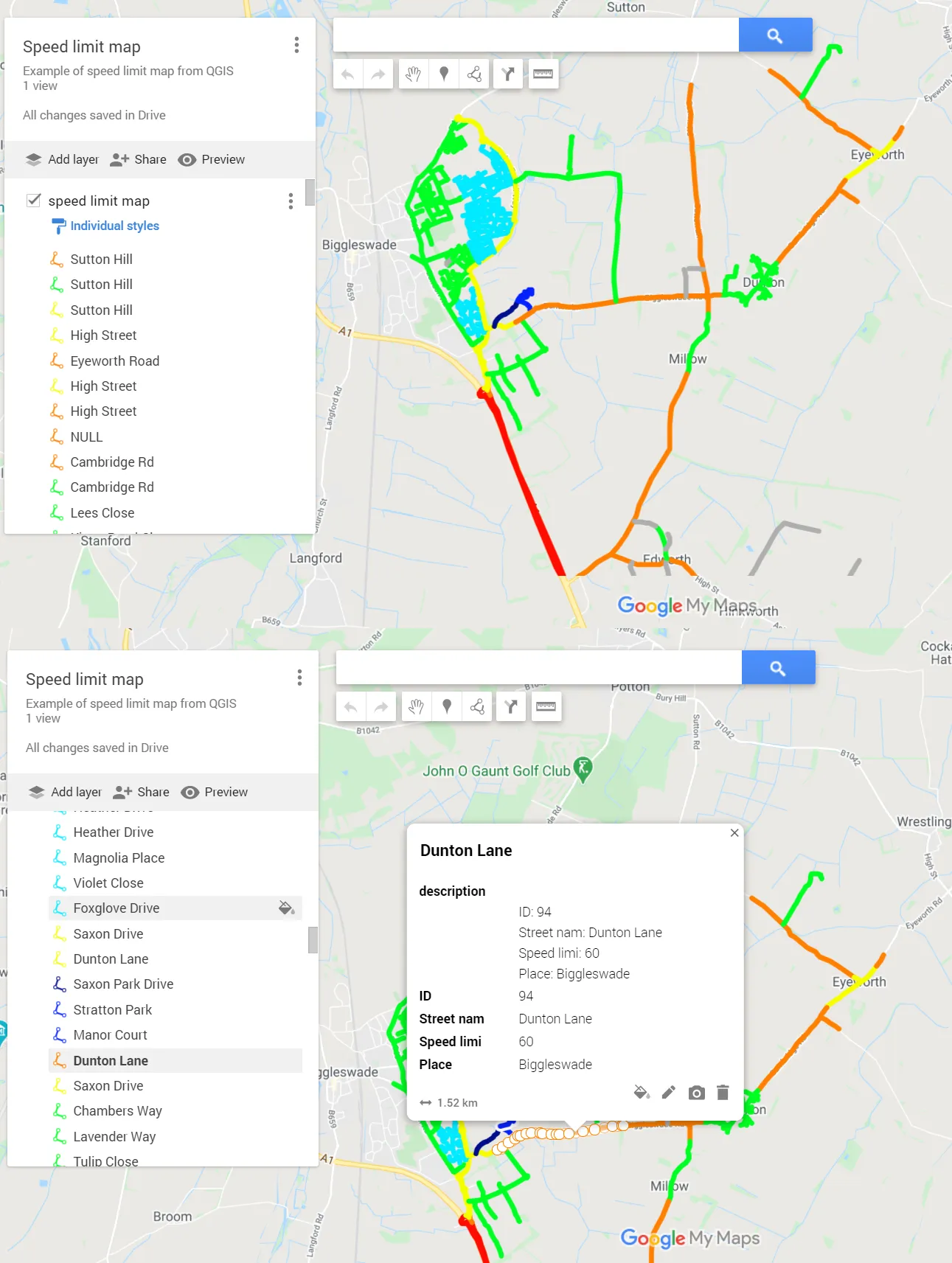
Pic. 21 Our speed limit map on Google Maps.
The GoogleMyMaps interactive map platform gives us the opportunity to load the .kml files without losing their properties. In the image above you can see, that all your work done in QGIS has been successfully transferred to the interactive map builder.
These two situations above are only examples of manipulation of our speed limit map outside of the QGIS platform. We can obviously convert it to the .geoJSON format and attach it to the web-based interactive map i.e. Leaflet. We can show our map in ScribbleMaps map builder and so on.
I hope, that I showed you clearly all this process, and creating the speed limit map by yourself in the future won’t be a big challenge.
Mariusz Krukar
Links:
Forums:
My Questions:
- https://gis.stackexchange.com/questions/368235/qgis-3x-categorized-style-customization-function-for-more-than-1-cryteria
- https://gis.stackexchange.com/questions/344830/digitalizing-png-image-in-qgis-3-8