
Making fibre FTTx schematics in QGIS
This article is dedicated to anyone, who works in the telecom industry and struggles with creating the FTTx schematics. We have several nice ways to combat our day-to-day work, although not all of them are for free – this is one reason. Another one refers to our particular project, which does not always fit with the options offered by the given software. We have at least a few ways of creating the fibre schematics in QGIS, which in fact require quite advanced methods often combined with Python console, custom scripts, or graphical modeling. Looking at it from a different angle, there is a notable common denominator between all of them – the basic network data. This data can be built from various linear and point layers, which can be i.e. the road network, buildings, or some interesting points from the infrastructural point of view. With respect to the first ones, we can even use the properly filtered data from OpenStreetMap. The core element here is nodes, which should be determined roughly at the place of the points, which will build our schematic. It can be called the clearness of the nodes database, which is equipped with both generic and relevant attribute data. Usually, these points correspond to the particular elements of our telecom infrastructure, although sometimes they can be simply addressed. Next, we can enrich these points with some additional attributes, which will state the properties of certain cable routing. Sometimes the addresses or buildings make up the third set of data, to which the FTTx connections are targeted.
By having both line and point layers on our map, we admittedly have the basis of our network. If any of the components listed above aren’t considered, we probably build up our own workload, which can be used later for extracting the fiber schematics. The primary goal of all of these QGIS approaches is to create the fiber schematic automatically or at least as quickly as possible and make it work as the technical map of the FTTx concept network across our project. What is most important, QGIS is able to give us enough set of tools for generating a usable fiber network plan. It works similarly to Visual Basic programming, where the Excel-based stuff lets on to do it. Obviously, we cannot omit the best platforms from the graphic and technical side, where we can visualize our work with the biggest effectiveness like AutoCad or FreeCad software. The web-based tools will be also helpful in this matter, but we should take care of our data from scratch. Unlike usage i.e. the QGIS, where we usually have our workload prepared, the web-based network diagram software gives us the graphical pattern to work on, but data must be input separately.
The solutions applicable for QGIS are for sure the best alternative for ArcGIS fiber schematics. My example shows a slightly different way than others because the process looks more style-based moving away from our exercises from the programming skills. Anyway, let’s get started!

Pic. 1 The goal of this article – make the FTTx fiber schematic straight from the QGIS project by saving it as a .pdf file.
The image above shows the essence of our work. On the very top, we have the QGIS project, which should be turned into the PDF version of the fiber schematic as presented in the bottom part of the image. The QGIS project includes a multitude of layers, in which a few of them will be used for the fiber schematic production (Pic. 2).

Pic. 2 All the layers included in the telecom QGIS project, from which a few of them are to be used for producing the FTTx fibre schematic.
Amidst this short list of layers, which is going to be used for our telecom purposes we can distinguish two types of layers in terms of their geometry. There are point layers and line layers. In this event, we should aim for a reduction of the number of layers to just 2 instead of 6 listed on the right (Pic. 2).
We can do it by merging as many layers as we can. We cannot merge all of them into 1, one because they have different geometry, as mentioned above. We have to do it twice, both for all point layers and all linear layers. For this purpose, the most advisable way is using the Vector -> Data Management Tools -> Merge Vector Layers (Pic. 3). This is the safest option with respect to our data attribute column titles. We can do it also by using the MMQGIS plugin, but our column title character length will be cut to 10 only. Nobody wants this.

Pic. 3 Merging vector layers in QGIS by using the Data Management Tools.
Merging layers with the same geometry is doable only when all the column types match each other in the attribute table. If not, the tool throws an error, which can be fixed by the “Refactor fields” tool available in the Processing Toolbox (Pic. 4).

Pic. 4 Refactoring attribute table in order to fix the layer merging error.
Finally, we can see the “Refactored” layer, from which we can extract the proper layer. Remember, that the “Refactored” is just a scratch layer, which will be gone when shut down your QGIS project. We can, in fact, choose the option to save this layer to the file instead.
When everything is alright, we should have two new layers appearing in our layer box. You will be lucky when they will be placed just one under another. Usually, they might appear somewhere randomly inside your layer panel list. When found, we should right-click on them and select the option “Move to the top“. The most important thing is having them at the very top, as we will use just them from now. Next, we should use the “Layers” panel bar, from where the “Manage Map Themes” (The eye) option should be used (Pic. 5). After toggling “Hide all layers” we obviously have a blank QGIS map, although this is the moment for easy bringing back just these layers, which we need (Pic. 6,7). On the other hand, we can launch these 2 layers in a separate QGIS project, in the case when the application is running slowly.

Pic. 5 Hiding all layers in the QGIS layer panel.

Pic. 6 Using the “Show selected layers” option.

Pic. 7 Displaying only needed layers in our QGIS project.
The image above shows just these 2 layers needed for building our fibre schematic. They are a result of merging 6 of them listed at the very beginning (Pic. 2). Now is probably the most important piece of our work – styling them. Before we do that, we should take a look at the attribute table of our merged layers and double-check it is all right. Just in case we can check the column name from “layer” to “Type” by using the “Fields” options when needed. On the other hand, you don’t need to do it, but it might be easier for you to define some rules in styling.

Pic. 8 Changing column name in Fields section.
At least in my case, the most important column in the data attribute table is the “Type” (Pic. 9). This is why I preferred to change the name from “layer” to “Type” previously (Pic. 8).

Pic. 9 The comparison of attribute tables of both layers used for building the FTTx schematic.
Whereas in our first layer, the column name has changed, in the second one we need to manage another problem – missing values in the “Type” column, which already are stored in the “layer” column. We should use the “Select by Expression” option for highlighting the ones, which match the particular “layer” value and next transfer this value to the column where needed (Pic. 10). Afterward, repeat this task for other situations such as this.

Pic. 10 Selection by expression and using the field calculator in order to provide missing values to the desired column.
This is the final moment, where we can start styling our cable routes. The best option for it will be selecting the “Categorized“ styling. The QGIS will classify all the options appearing in the “Type” column and allocate the coloration manually (Pic. 12). Before we do that, we should change the symbol of our “Simple marker” and, what is most important, adjust its size to “Map Units“. It will prevent our view from having the symbols extremely spacious against the map area. Because we should stick to the .pdf fibre schematic presented at the very beginning (Pic. 1), the best matching symbol is the pentagon (Pic. 11).
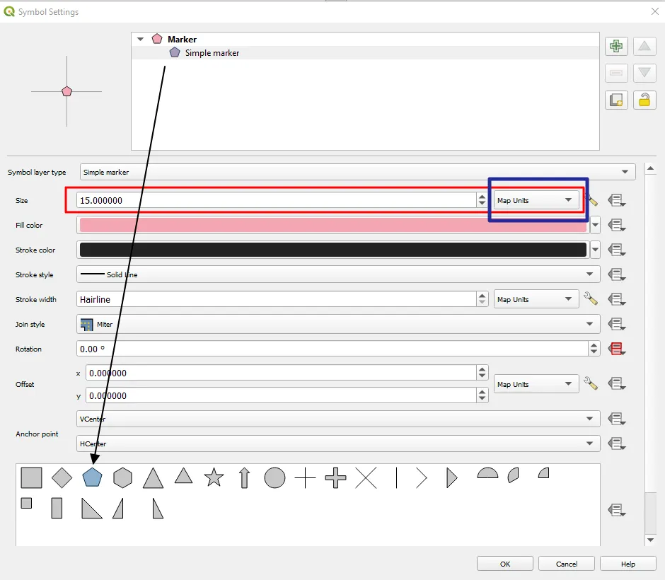
Pic. 11 Adjusting the “Simple marker” for the FTTx fibre schematic needs.
When our items are categorized properly, we can adjust their coloration as per the initial fiber schematic provided in order to fit the key. Finally, on our QGIS map, we should see something, which starts resembling our goal (Pic. 12).

Pic. 12 Styling our FTTx infrastructure in QGIS, where: 1 – the .pdf document with ready fiber schematic; 2 – the “Categorized” styling in QGIS; 3 – the general view after styling the infrastructure; 4 – the detailed view after styling the infrastructure, where the optimal scale is around 1:700.
It’s worth remembering the optimal scale, which allows us to see all of the items properly. It will come out much more when labeling. We want to retrieve all the labels on the same basis as they are shown in our .pdf document. Therefore labeling our telecom infrastructure will be a bit more difficult here.
Instead of relying on QGIS, which does the labeling automatically for us likewise the categorized styling, we have to define our own rules describing the circumstances of all essential descriptions we want to have displayed.
In the “Layer Properties“, we should select “Labels” and decide on “Rule-based Labeling“. As the .pdf document shows, for the infrastructure, we need effectively 3 separate types of labels. One for “Quantity“, another one for the “THP” value, and the last one for the item “Name“. Every single rule must be adjusted somewhat separately in terms of placement, offset, and also font properties when necessary (Pic. 13).
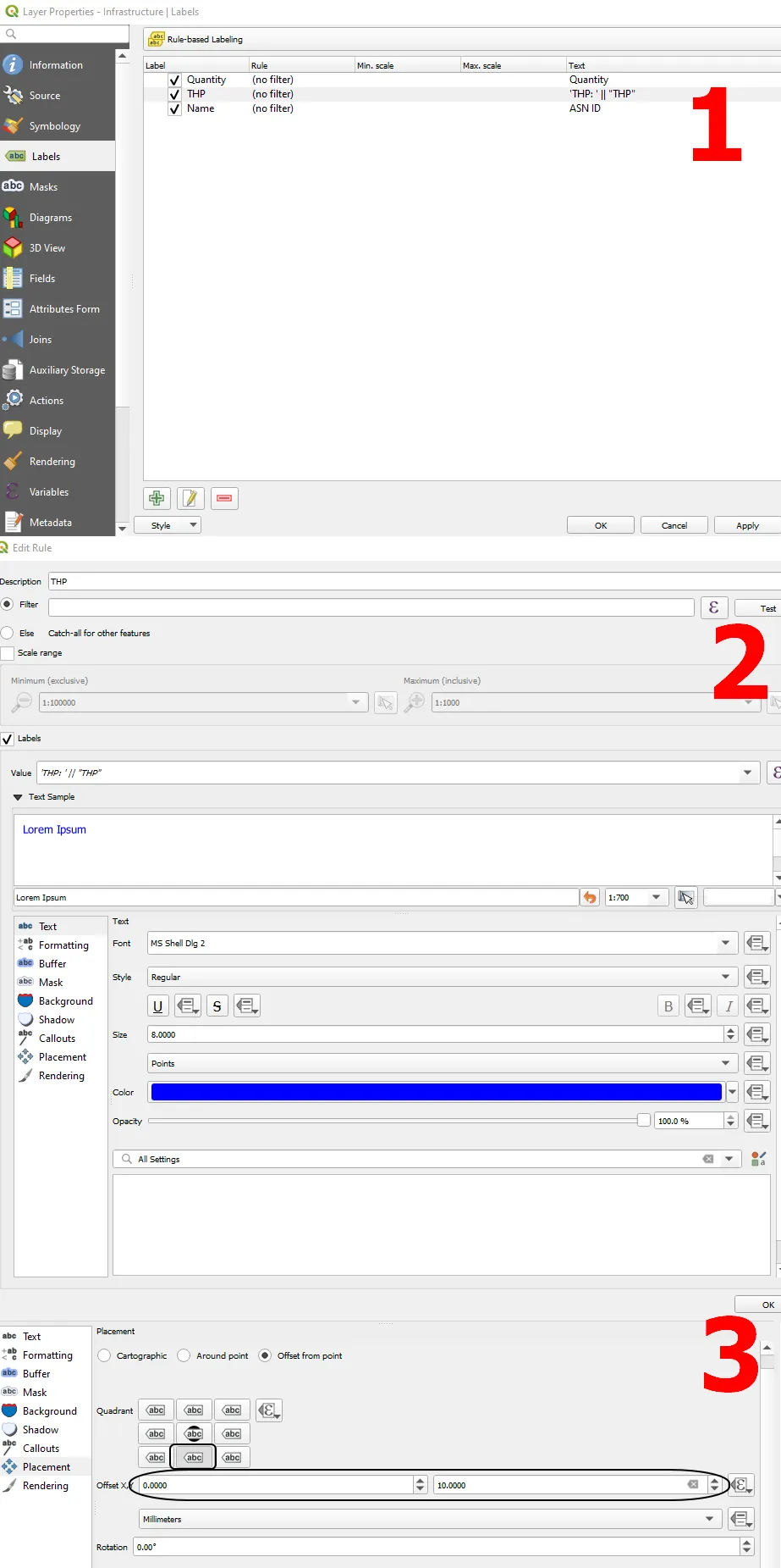
Pic. 13 Rule-based labeling of our FTTx infrastructure in QGIS.
As the outreach, I would advise to include also the scale-based visibility for these labels (Pic. 14). Otherwise, when zoomed out, your map view will be horrific, although remember, that our most important scale is about 1:700.
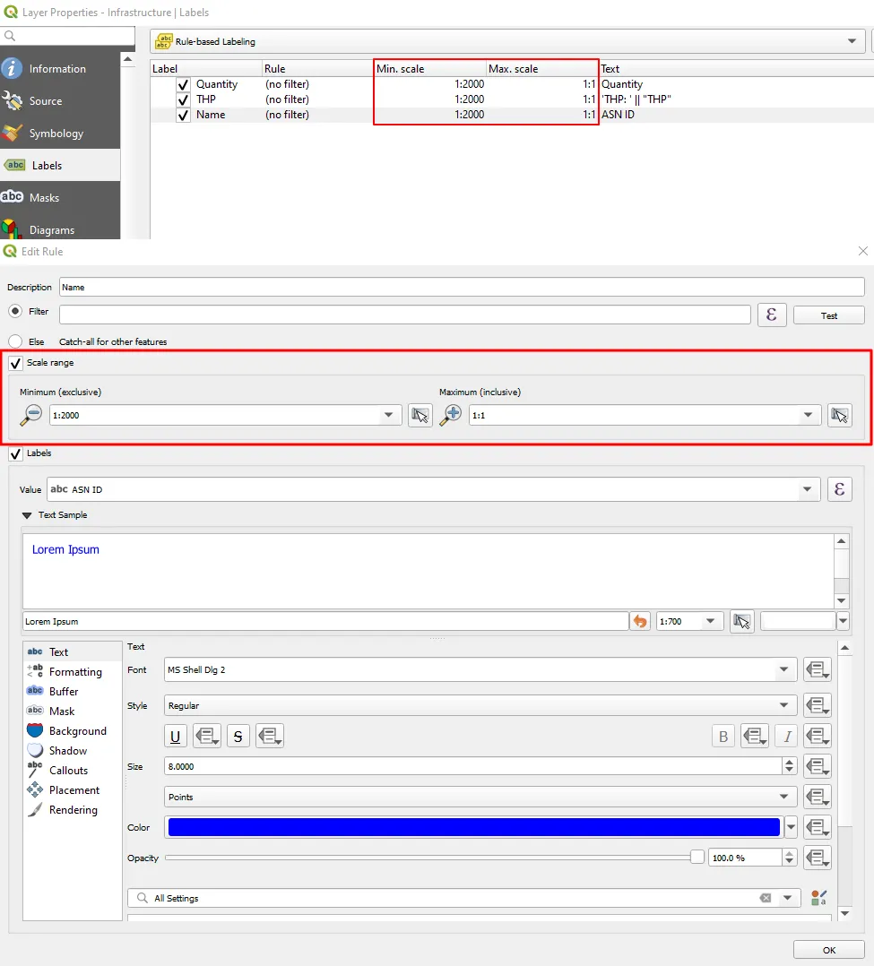
Pic. 14 The Scale-based labeling for our telecom infrastructure labeling.
The result becomes promising! (Pic. 15).

Pic. 15 The effect of styling the telecom infrastructure, whose symbology is the same as in the .pdf document.
Some features might overlap with the other ones. In the example provided, there are 2 types of infrastructure, which overlap each other (Pic. 16). In this case, there are a few ways to sort it out depending on what we need to have displayed on our schematic. I’ve used the “Offset” method for my example (Pic. 16), but I think a much better option can be customizing our “Layer rendering” by enabling “Control feature rendering order” or using the “Symbol levels” in the “Advanced” section (Pic. 17).

Pic. 16 Offset of the item, which is hidden by another one after categorized styling.

Pic. 17 Ordering of the categorized styling in QGIS by using the “Layer rendering” options (1) and changing the size of an object in order to make it visible along with the other one underneath (2).

Pic. 18 Both items located in the same place are visible now.
Next, we should do the same for our cable routes included in the linear layer on the bottom. However here the styling won’t be as simple as previously. We have to base our customization on two variables from the attribute column: “Type” and “Size“. The best option here will be using the “Rule-based” styling with formulas as shown below (Pic. 19).
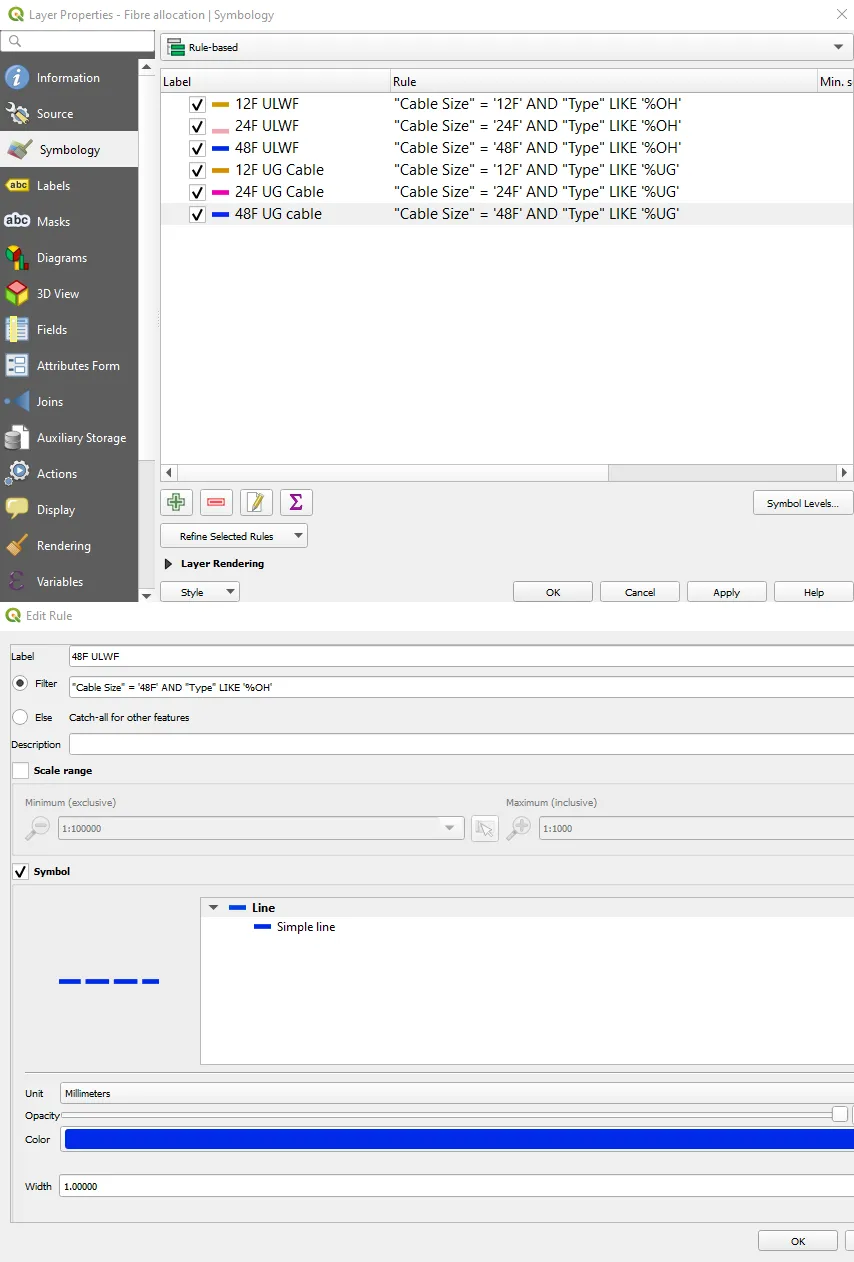
Pic. 19 Rule-based styling option used for the FTTx schematic production.
It should be enough to show our cable routes in an approachable manner (Pic. 20):

Pic. 20 Styled fiber cable layer in QGIS.
and the last thing we need here is labeling, which must be also rule-based (Pic. 21).
Pic. 21 Rule-based labeling for our fibre routes.

Pic. 22 Labeled cable routes.
Now, the labels start to look fine, although we have to make some clearance here. First of all, it could be vital to wrap the cable ID, as it seems to be too long. Secondly, we don’t need this number of decimals, and third, the size and meterage seem to appear in the wrong order. The label can be wrapped by using one of the “Formatting” options where we can use the “Wrap on character” option. However, if we want to have fewer regular line breaks, we should apply some formula, which example you can see below (Pic. 23):

Pic. 23 Breaking the label string (Cable ID) in QGIS.
and finally, our cable ID label becomes acceptable.
With respect to this outrageous number underneath, including about 10 decimals, we should add up the function, which will round up these values to some total value (Pic. 24). The easiest way to do so is using this function yet in the field calculator. Next, the label tool will render the content of our attribute column.

Pic. 24 Rounding the cable length values in the QGIS attribute table.
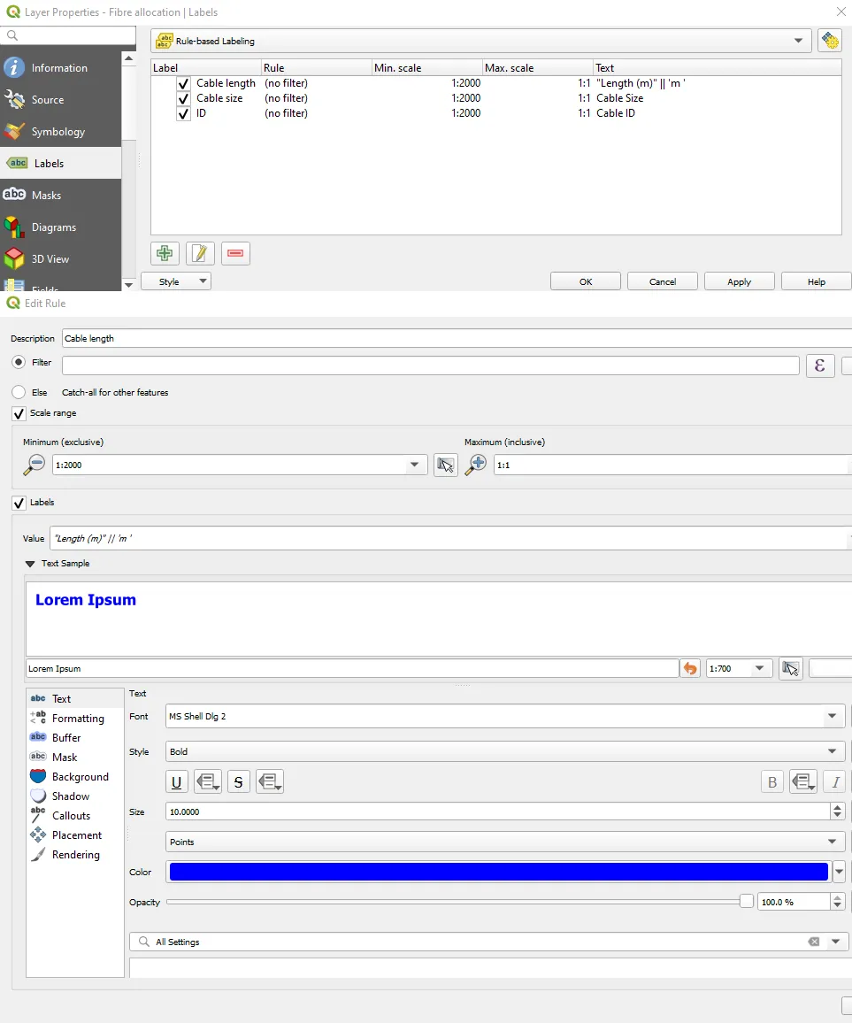
It starts to look nice now, although it’s still the last issue to fix (Pic. 25) – the order of information is wrong. We would like to have the “Length” first and the “Cable size” the second. In around half of the cases, it’s rough upside down.

Pic. 25 Fixing labeling of cable routes.
It can be fixed simply by taking down the first rule of our labeling, where the value describing the size of our cable will be simply transferred to the second rule describing the length. This is an example, where we can use multiple values in defining just one styling rule (Pic. 26).
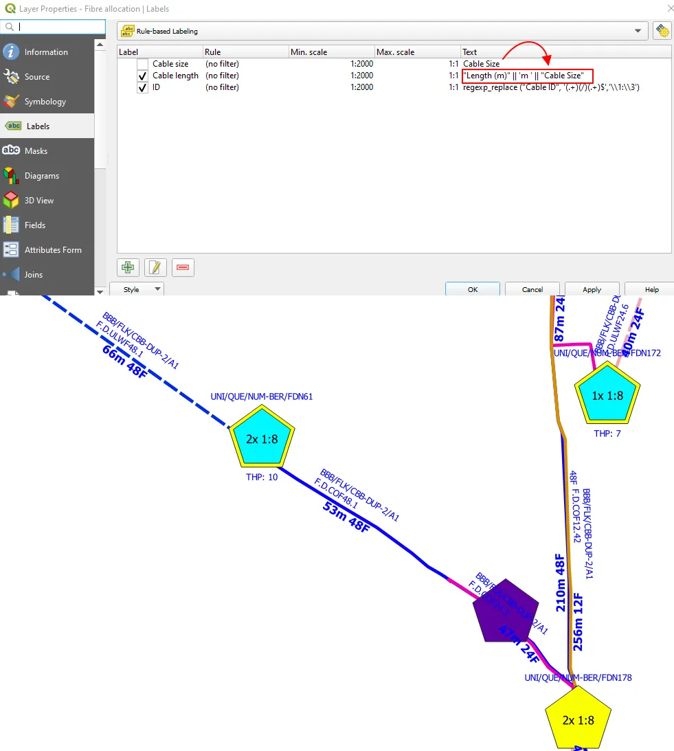
Pic. 26 Switching the order of our labels by “moving” our value to another rule.
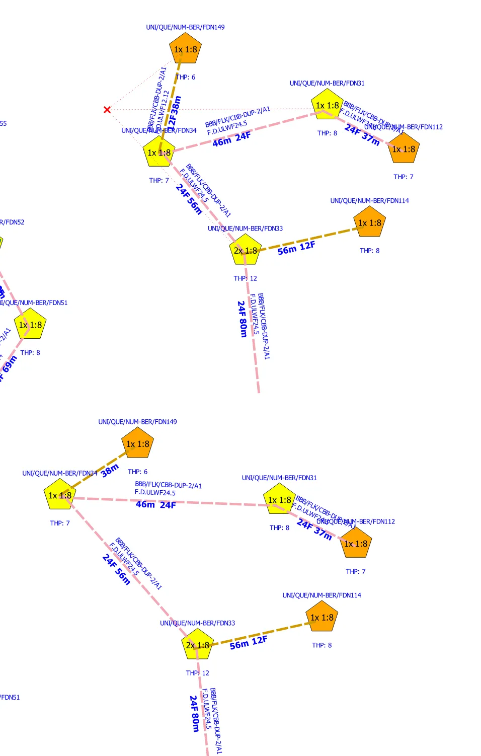
It looks like our styling is completed, at least by now! The project starts to remain the proper FTTx fibre schematic, known from the .pdf file presented at the very beginning (Pic. 1). Now, in fact, some technical steps must be done in order to make the schematic more straight and spacious. At first glance, all the cables have a lot of bends, which cannot go through, the same as the overlaps between them.
The great algorithm, which can be used here is Vector -> Geometry Tools -> Simplify. Thanks to it, we can make all our cable routes straight with custom tolerance (preferably 20-30 meters) as shown below (Pic. 27):

Pic. 27 Using the Simplify algorithm for fibre cable routes.
As a result, the new scratch layer “Simplified” is created, which you can see as black lines overlapping the current cable routes. Our next turn is saving this layer as the new one (or yet saving the processed layer to the file) and styling it in the same way as we did. It can be done quickly just by copying & pasting all style categories in one go (Pic. 28).

Pic. 28 Copy & Paste the style into our new layer produced by the Simplify tool.
At this moment we can completely forget the initial cable layer. It’s not valid anymore. We are working on our new, simplified linear layer now.
There is another, to be honest, the most important tool to use in this whole process. This is the “Topology editing” included in the Snapping Toolbar. If you do not have it visible in your top panel, you should go to View -> Toolbars -> Snapping Toolbar (tick the box). Make sure, that the snapping icon is selected and next toggle the “Topology editing” from another two methods available there. Don’t worry that much about the tolerance (in pixels just on the left). All the layers we consider for changes must be editable! The final thing will be the Vertex Tool for us (Pic. 29, Pic.30).

Pic. 29 Launching Topology editing and Vertex tool in the FTTx fibre schematic production.
Pic. 30 Topology editing in action. You can grab and drag (modify) two layers at once!
Two layers are editable at once, although for versions older than 3.16? they might not be edited this way at the very beginning. Instead of it, you have to drag them one by one, but just once. The second edition is always with two layers at once! Another thing, which comes out here is aesthetics. In our .pdf schematic shown at the very beginning of this text (Pic. 1) all the lines are not only straight but along with infrastructural items, they’re lined up. There are rather no diagonal crossings like those displayed in the image above (Pic. 30). We can prevent our fiber schematic from situations such as these by applying the grids for our working area (Pic. 31).

Pic. 31 Applying grid lines to our FTTx fibre schematic in order to make everything lined up properly against each other. The grid should cover the current telecom infrastructure layer.
The grid layer can be created from Vector -> Research Tool -> Create grid. Important is to set its range to the range of one of the layers used for our FTTx schematic purpose. Preferably it can be infrastructure (the point layer). The reasonable grid spacing can be set for both directions (X, Y) as 100 units (meters), which should be enough (Pic. 32), although sometimes we need another, denser auxiliary grid line with 50 or even 25 units (Pic. 34).

Pic. 32 Grid layer coverage for our fibre schematic in QGIS.
Now, by using the snapping tool, we can easily adjust our cable routes as well as the telecom items straight to the grid lines (Pic. 33).

Pic. 33 Topology editing in action along with snapping vertices straight to the grid lines.
The best way is using the “Snap to segment” option with tolerance set to about 10-25 pixels.
After all, our schematic should look as per below (Pic. 34).

Pic. 34 Our FTTx fibre schematic is almost ready, we need just to rotate the items. As you can see another auxiliary grid line has been applied with 25m of density.
For the rotation purpose, it’s good to create new columns in our attribute table, which will define the angles and alternatively also some combination when necessary (Pic. 35). The rotation, as well as the number of cable routes going from the given object, determine the final position of the label.

Pic. 36 Something like the “FTTx alphabet” which can be used in order to configure the telecom infrastructure placement in QGIS against the main cable route.
Having everything sorted such as this, we can back to the Labels, and being precise to the Placement section of every single labeling rule provided earlier (Pic. 14) we can define the statements as follows (Pic. 37):

Pic. 36 Using the Expression String Builder for defining the telecom items rotation conditions.
which is an example of one of the rules applied. Since we have 3 single labels, we should consider a similar approach for them too. When everything is correct, we should have the final version of our FTTx fibre schematic with both great labeling and proper rotation of some items (nodes)(Pic. 37).

Pic. 37 The final version of our FTTx fibre schematic made by QGIS.
The very last stage is saving our work as a .pdf document, the same as issued at the very beginning of this work (Pic. 1). It can be done via Print Layout, where we should take a look at a few major features shown in the image below (Pic. 38).

Pic. 38 Our FTTx fibre schematic is plotted in the Print Layout with all important elements listed: 1 – title (text label); 2 – adding the map; 3 – dragging the map; 4 – adding the legend; 5 – export as the .pdf file.
They are:
– 1) – text label, which can state the title of our map. Here is the trick, namely when we stick both borders to the edge of the paper, our text will be always at the center, when the center alignment was selected before,
– 2) – adding map canvas – by dragging the box, where the map will be dropped. Usually, our map view won’t correspond to the situation in QGIS, so we should play with it a bit. In this case, the most important can be setting the paper size, which comes in the A4 as the default. By right-clicking on our paper (outside of the map and any other element) we can choose the “Pages properties” including the “Paper Size” option. I don’t think even A0 will be enough for a large area such as this, so we can play with the “Custom” size by dragging and adjusting our map simultaneously,
– 3) – dragging map content – is very useful when we want to adjust our map to the whole page area or be precise to the map bounds defined in our print layout, which can be changed by toggling the white arrow above (although I assume, that you use the whole paper space for a map like this),
– 4) – adding the legend
– 5) – export the whole map as the .pdf file
At the moment, when our map is being adjusted we should remember the scale, which must be always about 1:700, which is about right for the SLD schematic like this (Pic. 39).

Pic. 39 Defining the general scale of our FTTx schematic in the QGIS print layout.
Remember, that the scale changes as we adjust our map! You have to “visit” this property quite often and adjust the scale too. Another thing is the legend (key), which also requires an additional hassle (Pic. 40).

Pic. 40 FTTx fiber schematic key alterations in the QGIS print layout.
In the default option, our legend comes as just a 1-column list including all the layers actually being used (or unused) in the QGIS project. It’s not right. Our duty here is to remove the ones, which are not needed. Effectively we need just the key for the “Infrastructure” group categorized with styling as well as the information about fibre cables. These 2 layers (legend entries) stay, another must be removed. The first thing to do here is to switch off the “Auto-update” option, which feeds our legend automatically from the QGIS project. Next, by using the red minus symbol, we can remove unnecessary entries (Pic. 40). At the very end, we can change our legend in shape, which might be needed i.e. for further using it in Excel. There is the “Columns” section, where we can define the number of columns comprising our key. They won’t be equal to each other and will be sticking to the given layer categories unless we switch on the “Split layers” option as shown (Pic. 40).
Finally, we can export our FTTx fibre schematic as the .pdf file and use it!


Pic. 41,42 – The final comparison of the FTTx fibre schematic between the .pdf file presented at the very beginning and the final version also saved as the.pdf but done in QGIS instead of Microsoft Visio or other software.
Mariusz Krukar
References:
- 2017, Using QGIS for FTTH/GPON network planning due to the implementation European Digital Agenda, Softelnet, Kraków
- Matrood Z.M., 2014, A simple GIS-based method for designing fiber network, (in:) International Journal of Engineering and Innovation Technology (IJEIT), vol. 4, issue 2
Links:
- https://www.qgis.org/en/site/about/case_studies/poland_ffth.html
- Download Geospatial Network Inventory FREE
- https://www.techrepublic.com/article/get-it-done-diagram-a-building-to-building-fiber-network-with-visio/
- SmartDraw: Diagram Network Software – download
- https://plugins.qgis.org/plugins/FiberOpticNetworkDesignSystem/
- https://www.eib.org/en/stories/what-is-gpon
- https://www.geomaptric.co.uk/planning-ftth-networks-with-qgis/
- Github.com:FTTH-Fiber-Optic-Network-Design-System
- https://dokumen.tips/engineering/real-fibre-optic-ftth-fttx-network-design-engineering-planning-software-for-autocad.html
- https://www.ge.com/digital/tech/how-gis-based-network-inventory-accelerates-design-fttx-networks
- https://www.schematics.com/project/optical-fibre-link-final-19562/
- Arcmap: Tutorial-Fiber-Manager-Creating-Schematics-in-Fiber-Manager
- https://ksavinetworkinventory.com/network-inventory/#qgis_distribution
- https://docs.qgis.org/3.22/en/docs/user_manual/working_with_vector/vector_properties.html#layer-rendering
Forums:
- https://gis.stackexchange.com/questions/157182/schematic-map-in-gis-tools
- https://gis.stackexchange.com/questions/374606/creating-network-flow-diagram-using-qgis
- https://gis.stackexchange.com/questions/336266/creating-grid-following-points-in-qgis
- https://gis.stackexchange.com/questions/25061/merging-multiple-vector-layers-to-one-layer-using-qgis
- https://gis.stackexchange.com/questions/30084/creating-multiline-labels-in-qgis
- https://gis.stackexchange.com/questions/109853/qgis-multiple-lines-and-wrap-on-character
- https://gis.stackexchange.com/questions/83686/multiple-labels-for-one-layer-in-qgis
My questions:
- https://gis.stackexchange.com/questions/427693/qgis-multiple-case-when-doesnt-work-in-rule-based-labelling
- https://gis.stackexchange.com/questions/430424/qgis-ordering-categorized-styling-doesnt-work/430427#430427
- https://gis.stackexchange.com/questions/426394/qgis-defining-the-nth-character-where-the-label-could-be-wrapped
- https://gis.stackexchange.com/questions/430518/qgis-multitude-rule-based-labelling-returns-wrong-label-order/
- https://gis.stackexchange.com/questions/427018/qgis-use-move-feature-for-two-layers-with-different-geometry-at-once-with-attr
Youtube: