

The contrast issue has been mentioned in this article, and either during the description of the role of horizontal visibility in long-distance observations. Because the information is not sufficient enough for my further studies I would like to point out more matters arising out of the contrast in a general sense. These elements are very important because explain the role of light level difference, which shapes the ability of human vision.
The contrast simply is the difference in the luminance or color, which makes an object distinguishable from its background or another object. Regarding human perception in the real world, we are understanding contrast as a difference between the brightness and color of an object to that of another object visible in the same field of view. The basic feature of the human vision system is bigger sensitivity to contrast than absolute luminance, which means that our perception of surroundings is pretty much similar disregarding the huge illuminance level changes throughout the day or between some places.
- EYE RESPONSE ON THE LIGHT INTENSITY
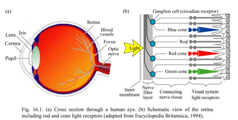
The human eye has the ability to respond to a vast range of light intensity in excess of 10 units of the logarithmic scale. It can be done by two types of retinal-photo receptors: cones and rods. Cones work under bright-light conditions, unlike rods, active at night when the stream of light is low (Pic. 1, 2).

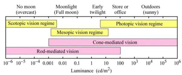
The human vision of light is generally divided into three illuminance-dependant levels, that has been roughly described in this article. Here I am going to show the chart, where you can learn about the human eye response to the specified light conditions (Pic. 3).
Now I would like to focus on the luminous intensity generated by various objects being in the human eye’s field of view. As we know, luminous intensity is the value (power) falling at the solid angle unit, which has been widely explained here. The reference point for the luminous intensity definition is the peak of the human eye response to light – 555nm in the vacuum. It results in an 18.40mW radiant flux when the light is emitted evenly in all directions. This value can vary, as the human eye responses on the wavelength range between 380 and 800nm (peaking at 507nm at night). On the other hand, our human eye can see the light only in the direction of the field of view. In this case, we will talk about luminance, which is a measurement of the luminosity in a certain direction.
The standard spectral response of human perception is described by the luminous efficiency function. The subject of this function is the description of the subjective light sensitivity of various wavelengths by an individual person. This light sensitivity varies under different lighting conditions. It triggers the pupillary light reflex, which controls the diameter of our pupil. The luminous efficiency function describes an ability to the detection of colors and details of objects, which can be achieved mainly under photopic vision conditions. This function describes also the ability of the human eye to detect light under various wavelengths. Some wavelengths are detectable much easier than others (Pic. 4).
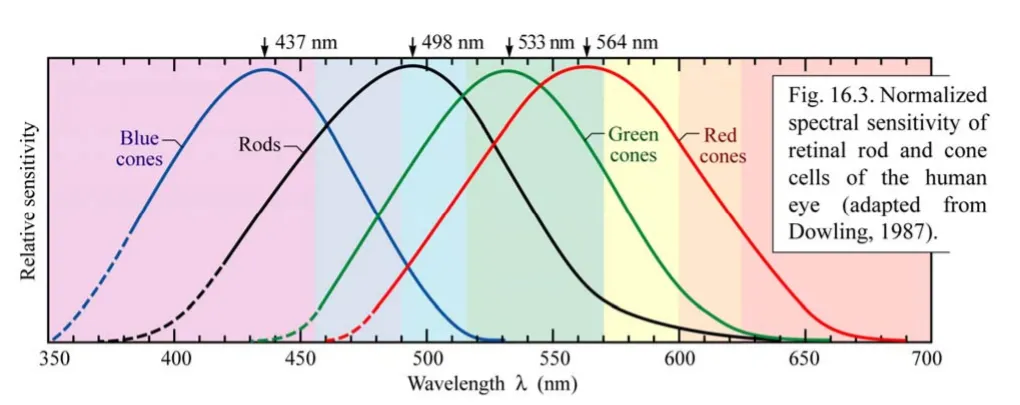
In the theoretical understanding, when the relative sensitivity of the human eye on the wavelength given is 0.2, then it means, that this sensitivity corresponds to 20% of the maximum relative sensitivity of the human eye, which falls at the 533nm in daylight conditions (photopic vision) and 498nm in twilight conditions (scotopic vision). Practically, the source emitting a wavelength with the aforementioned 20% sensitivity is effectively seen 5 times weaker, than the source with a maximum sensitivity of the human eye. So imagine, that you have an object with a green and red appearance in the daylight condition. The green object will be the most visible to the human eye because the eye is the most sensitive to the green wavelength. An object with different colors, with mentioned 20% sensitivity must emit 5x light stronger to be the same visible as the green one. That’s why we have a “safety green”, represented i.e by vests or some signs (Pic. 6).


Under the scotopic conditions, the general vision changes slightly as the highest spectral sensitivity moves towards the green-bluish colour.

For my studies about contrast very important thing is brightness – the perception, which we can get from the visual target. The brightness is a subjective property of each object as well as the parameter of color appearance. This attribute of visual perception tells us about the radiation or reflection of the light. In other words, the amount of light, that the human eye detects from the object. It is important to explain the difference between brightness and contrast at this stage. Since brightness defines the overall lightness or darkness of an object given, the contrast will describe the brightness difference between two separate objects. When the difference in brightness between these two objects is extremely low, then it’s highly likely, that it falls below the contrast threshold, making the object not possible to distinguish.
Both the contrast between these 2 objects and their individual brightness will vary depending on the distance to the light source and the strength of this light source too.
In the summary of this section, it is worth recalling the 3 major operation modes of the human eye depending on the light level, which has been mentioned at the beginning. As illumination declines, the human eye adapts to new conditions. It happens alongside conserving light. During the light drop process, the number of photopigments in the retina increases, unlike light streaks, when they are bleached, triggering electrical activation, which results in a visual sensation. However, this electrical activation of the human retina is not translated into light sensitivity. The situation looks another way around when the light is dim, then the amount of bleached photopigments is much smaller, making the retina more sensitive to light.
There are two key effects associated with the human eye’s adaptation to night vision. The first one, which has been mentioned in this article is the Purkinje effect. The other one, also very important is related to the cones and rods distribution across the retina. The cones are concentrated in the central field of visualization. In turn, all of them are packed tightly in the very center of the fovea. The distribution of the rods is different because they appear mostly on the periphery of the retina. In the fovea are only a few of them. This results in the best view by eye not when looking directly at the object, but when you are looking a bit off to the side.
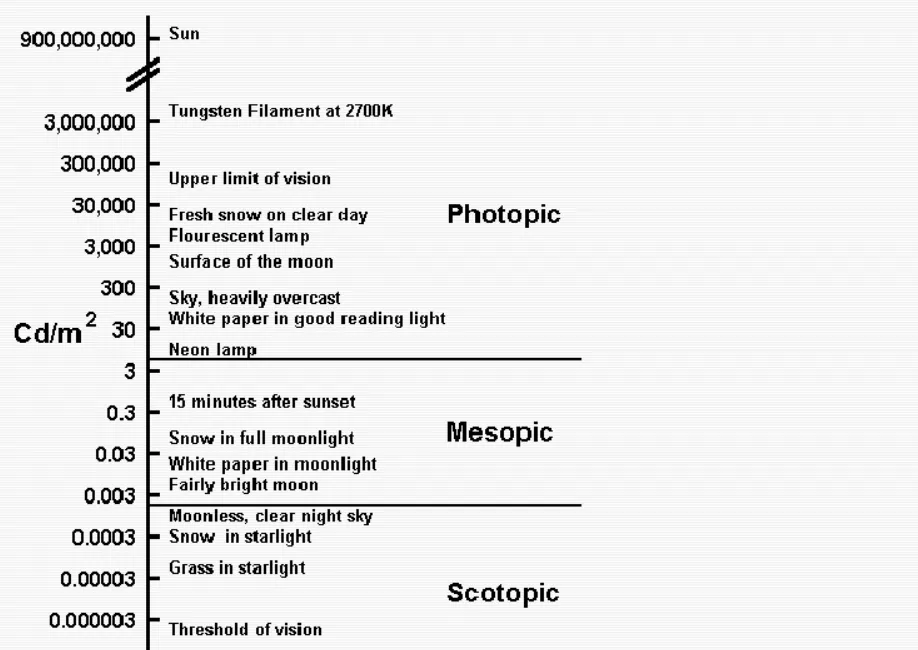
Looking at the graph below, we can see what elements can be assigned to the specified level of light (Pic. 9).
2. THE MEANING OF CONTRAST
Contrast can be considered in triple meaning. The first thing, that comes to our mind is the difference in luminance between two separate objects. In this case, the absolute luminance of these objects is not important, as the major role plays the relative difference of this luminance between them. Taking into account the constant adaptation of the visual system, larger luminance differences produce bigger brightness differences, which results in higher contrast.
Secondly, the contrast is a result of different colors, tints, hues, and shades. Often the light coming from different objects has a different color. Even, when these colors are in proximity to each other, the contrast exists. That way both objects can be distinguishable. Under the meaning of “color”, we can consider both completely different colors and also smallish differences between two similar colors expressed with their tints or tones. Sometimes the difference in colors arises out of nonuniform radiation, caused by some obstacle, casting a shadow. On the other hand, shadows can also reduce the contrast between two surfaces, as per the video below.
The variety of colors leads us to singularise a few types of contrasts (i.e. light-dark contrast or the contrast of quality, caused by different color saturation).
The third meaning of contrast is the most important for us. It describes the adaptation state and perception of the human eye. In terms of the level of luminance, we must know, that a difference in luminance that produces a large difference in brightness on a dim background will result in a smaller difference in brightness, when the background will be brighter, because of the visual adaptation of the human eye. In this situation important is the average luminance of the surroundings, to which an eye is adapted. However, this adaptation state can be affected individually, which is driven by different kinds of stimulus patterns. In this case, we are talking about the luminance (brightness) contrast. The brightness contrast effect is not valid enough when the assimilation phenomena are coming through. The assimilation implies the inability of brightness determination purely by local contrast. As a result, the contrast effect describes a negative correlation between judgment and information in the context. Best examples of contrast assimilation apply to the changes produced in the lightness of the grey background by the presence of black and white lines (Beck, 1966) (Pic. 10).

Another type of contrast is color contrast, which is a result of a different kind of light wavelength coming from the object observed. The color contrast can be detected as a result of eye perception, which is reliant on both illuminance conditions and light wavelength. The biggest contrast is produced between black and white, although it is much more related to brightness than the color itself. Important is, that big color contrast will be produced by completely different colors (Pic. 11), unlike their tints, tones, or saturation, which will cause a lower contrast.

On the contrary to color contrast, we can place the color assimilation (the Bezold effect). This is an optical illusion displaying different color appearances depending on its relation to adjacent colors (Pic. 12).

The eye adaptation tends to produce additional perceptual effects, revealing contingencies between two different visual attributes. It’s driven by neuronal populations, which tune selectively to the adapting stimulus, and next become fatigued, leading to a relatively higher sensitivity. This result is described in i.e. McCollough effect, which is an orientation-specific color aftereffect (Paramei, Leeuwen, 2016)(Pic. 13).
Returning to the presence of contrast and the ability of the human eye to detect the contrast between two objects it’s important to mention, that in both illuminance and color, the contrast can be detected without object identification.
In other words, the threshold of contrast for detection is lower, than the threshold of contrast for identification (Valberg, 2005). Nevertheless, the threshold of contrast for detection can be explained in the same ways as the contrast types have been explained. Namely, when the person can detect some smallish luminance differences, then we will talk about the illuminance contrast threshold. When the person is able to spot some color differences, then we will speak about the color (or chrominance) contrast threshold. The more important factor, in determining the perception of contrast itself is the size of the object, next to its form and alternatively temporal variation (Valberg, 2005). If these 3 factors are favorable, then contrast can be detected for objects larger than 0.2 degrees in visual angle. If the object borders are less distinct or have diffused edge zones, then their sensitivity decreases to about 70% of the value with sharp edges (Valberg, 2005). The sensitivity for contrast increases for objects bigger, than 0,2 degrees and is not affected by the blurring of sharp borders anymore.
Whether the narrow line or small dot can be detected or not depends mostly on the luminance difference threshold of the visual system for the prevailing state of adaptation (Westheimer al. 1981). A very good example of this is the single star in the night sky. In this event, we cannot say about its 0,2-degree size, because it’s located in the infinity. It makes the infinitesimal object dimensions as a result. Its visibility depends only on the luminance intensity and the background then.
3. CONTRAST SENSITIVITY OF THE HUMAN EYE – GENERAL OUTLOOK
This chapter is a continuation of the third meaning of contrast described above. Basically, contrast sensitivity is the ability to detect this contrast. Again, the contrast pattern is produced by changes in luminance, which conveys the majority of the information to the viewer (Drew, 2005). The ability of the human eye to detect the contrast results from the overall brightness of the scene and the intensity of ambient and background light (Drew, 2005). The “size” of the contrast sensitivity of the viewing system varies, depending on the object features. An object with fuzzy or detailed borders will require bigger sensitivity, unlike to object, whose borders are sharp.
As we know, the human eye retina comprises rods and cons. The rod sensors are about 100 times more sensitive to contrast than the cone sensors, which are color-sensitive. The rod sensors, which were mentioned also above, are concentrated further from the center of the retina, in the areas used for greater than 10-degree field of vision. This extra sensitivity is used i.e. for astronomers studying the contrast changes in the star fields or for simple stargazing. In some situations, contrast sensitivity is more important, than the sharpness of our sight. It happens, especially in the situation, when the observed object is very close to the threshold luminance difference. In this situation the contrast sensitivity allows us to just detect this difference (just-noticeable difference – JND). This detection is dependent upon the size of the object, its pattern (spatial frequency expressed by specified light wavelength luminance), and also the time span, when this object is detectable (taking into account, that its features change due to shades, light source position, etc.). This just-noticeable difference describes an amount possible to detect in the absolute threshold – the lowest level of stimulus. The average difference in luminance between the subject and background, estimated for the JND is 2%. More about it is included in the Weber-Fechner law section, described below. Staying at this point we should explain what is the spatial frequency mentioned above This is the number of image cycles, that fall within a given spatial distance. It’s finally expressed by the number of cycles per arcdegree. These image cycles build each optical signal, which can be divided by single striations featuring sinusoidal luminance changes and different spatial frequencies.
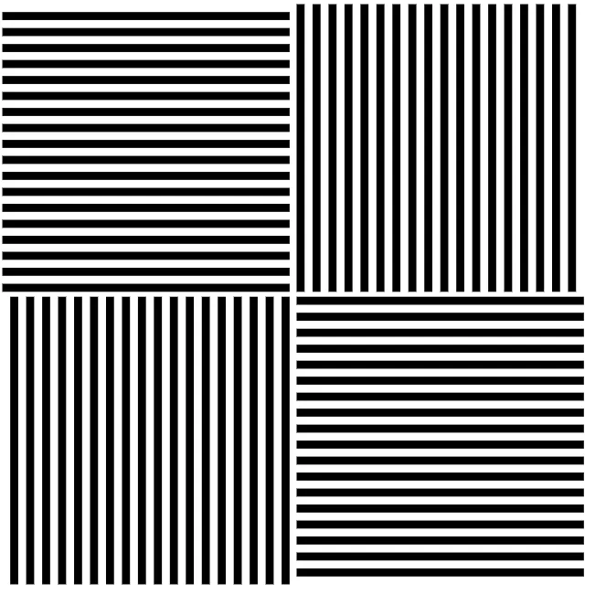
Hence the sinusoidal gradings became the basic way to examine the contrast sensitivity (Pic. 14).
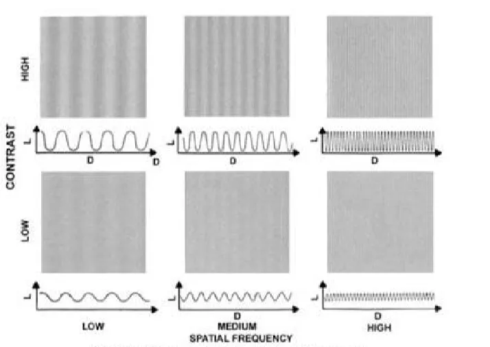
The role of sinusoidal gratings is important because they show the performance of the human eye at the entire working range (Arden, 1978).
The minimum contrast at each spatial frequency is described by the contrast sensitivity function.
The contrast sensitivity function is often referred to as the Modulation Transfer Function (MTF) test, which requests from an observer the comparison of the contrast between two sine-wave gratings. One of them represents the fixed contrast and spatial frequency, whereas another one displays different spatial frequencies and variable contrast. The contrast sensitivity function defines the first sinusoidal grade, which is visible to the observer.
The contrast sensitivity function (CSF) defines our window of visibility. This window of visibility is drawn by a line marking the border of the range of our contrast sensitivity. It’s perfectly shown in the images below (Pic. 15, 17).
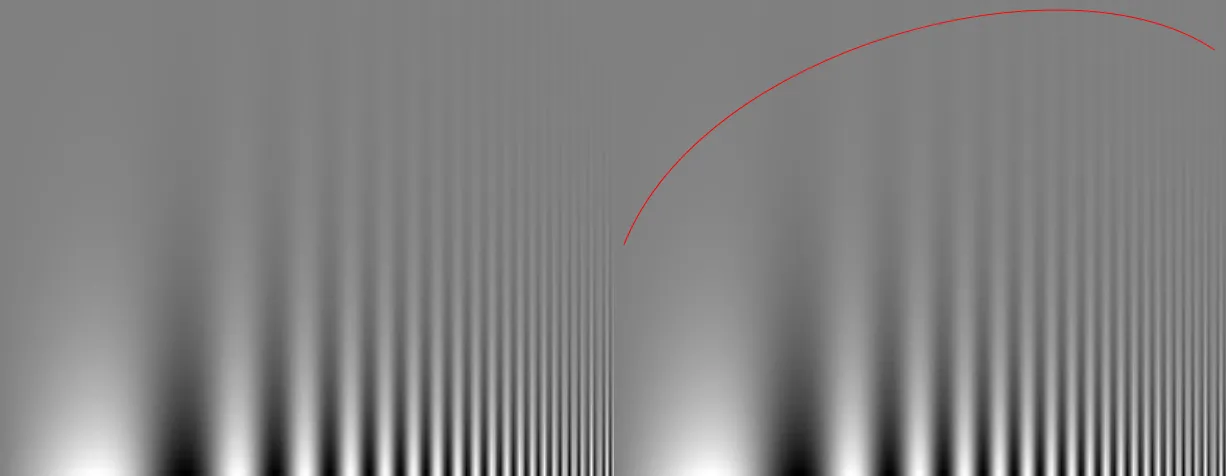
Looking at the image above, we can see how the frequency increases as we look toward the right. Our bars are thinner and thinner. At the same time the contrast decreases from the bottom to the top, because these bars become difficult to see. Imagine, that you are standing at some distance from this image. Now what you can see is the range of spatial frequencies and the contrast values, where the bars are barely visible. Beyond them, we can see a uniform background. So now, we can mark the red line, as shown on the right part of the image. This red line marks now our threshold of visibility.
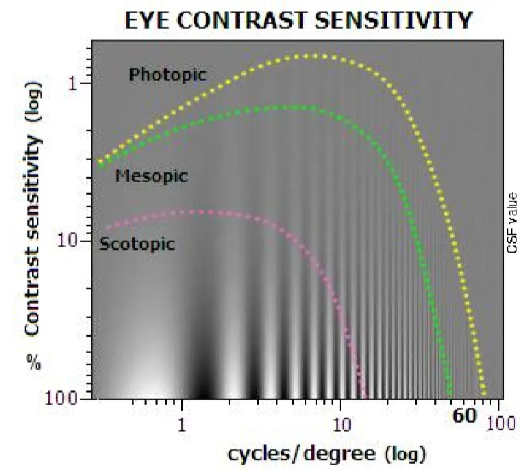
Both MTF and CSF are different depending on the level of scene luminance. (Pic. 15).
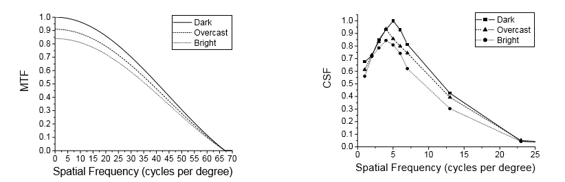
For an average luminance of 40cd/m2, the maximum contrast sensitivity falls on the 3 striations per 1 degree (3 cycles/degree), which corresponds to 0,3% according to the Michelson contrast definition. If we consider for instance 1 cycle per degree, then we are talking about one white bar and one black bar.
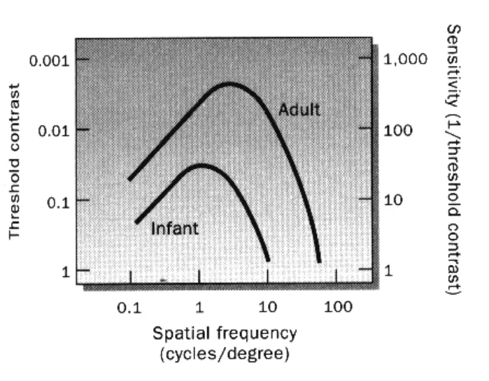
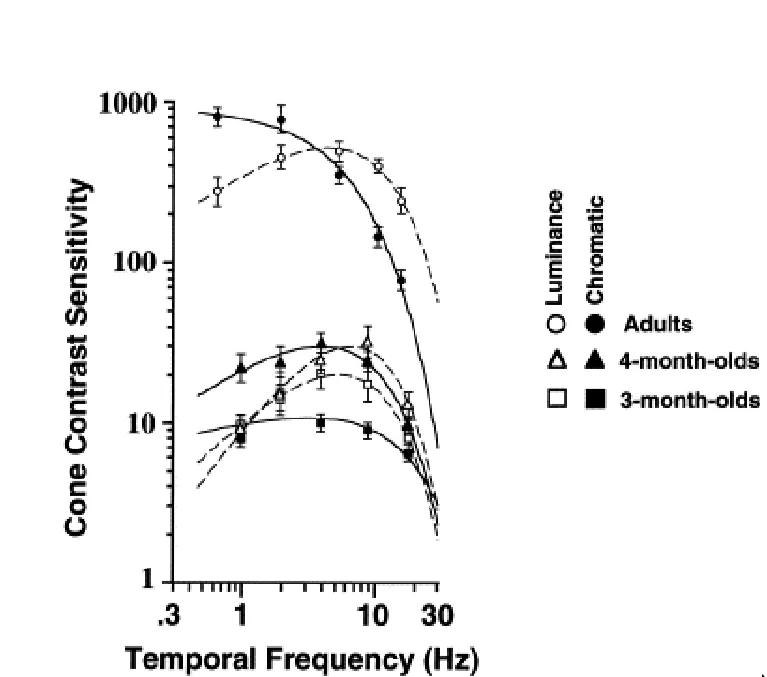
The CSF varies also in terms of the human age (Pic. 18). Basically, the infant won’t be able to see spatial details the same as the adult does.
The contrast sensitivity changes also in adult life (Pic. 19).
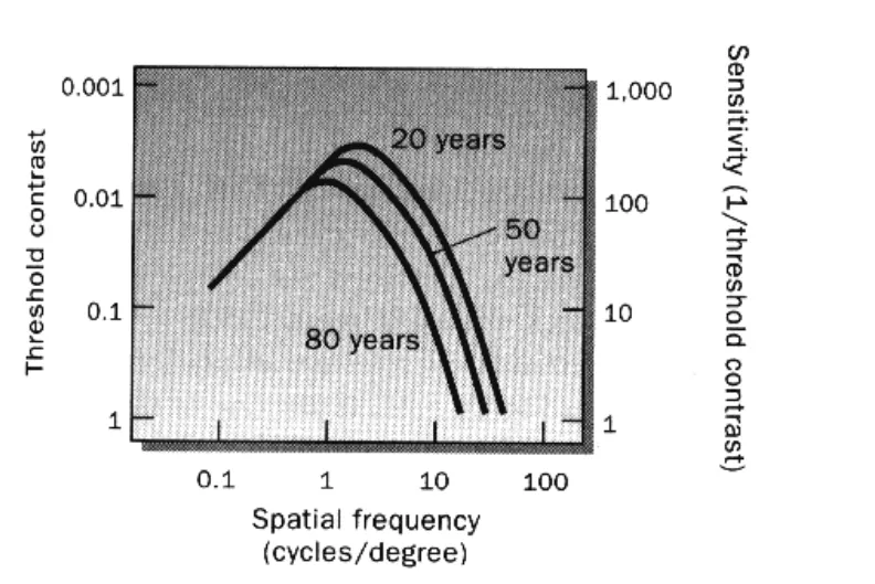
To be specific, as human gets old, spatial frequency is loss in a steady way, making the visual acuity worse. It’s driven by optical changes in elderly eyes.
A specific way to gauge the contrast sensitivity of the human eye is contrast modulation. The contrast modulation measures the display’s ability to distinguish the pattern of parallel, one-pixel-wide black, and white lines. When the higher percentage of these lines is possible to determine, a clearer picture, text, and view appear. In practice, the young human eye is able to detect between 3-5 cycles per degree, which makes the 0.2-degree size objects visible to an observer. In turn, the young human eye can detect 500 cycles, which corresponds to 0,2% (Pic. 20).
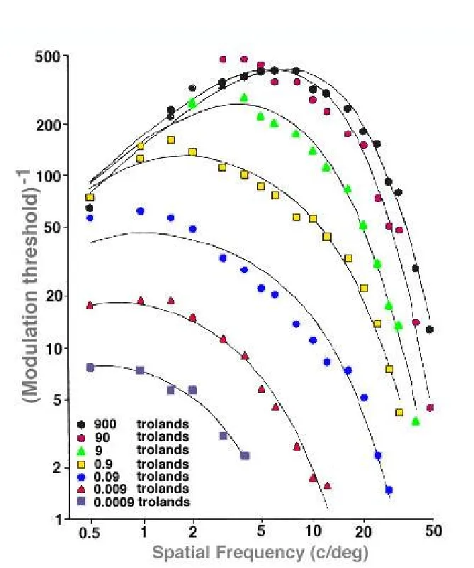
The values of the contrast sensitivity are expressed in trolands. The troland is a visual stimulation unit at the retina equal to the illumination per mm2 of pupil obtained the 1 lux brightness from the eye surface. In other words, it measures the total light value impinging into the human eye and it’s expressed as the retinal luminance. The retinal luminance is the luminous flux impact on the retina, which can be declared with the cd/m2 units. Turning it into practice – the amount of 900 Trolands corresponds to 127 Nits. As we know from the previous article 1 Nit has been replaced by 1cd/m2. The 1cd/m2 is exactly the 1Lx. So the amount of 900 trolands will be equal to the 60W bulb. Optimal viewing conditions occur around the 300 Lx value. These conditions correspond to level 2 of visual acuity (full visual field according to the Snellen test) (Pic. 29). Besides the contrast sensitivity, we can point, to the temporal contrast sensitivity, driven by the flickering of the objects. The temporal contrast sensitivity function (TSF) measures the sensitivity to temporal sinusoidal changes in the comparison stimulus. In other words, it determines how flicker varies in contrast. The human eye appears to be the most sensitive to a frequency between 15 and 20 Hz at high levels of luminance, typical for photopic vision (circa 300 Lx) (Pic. 21).
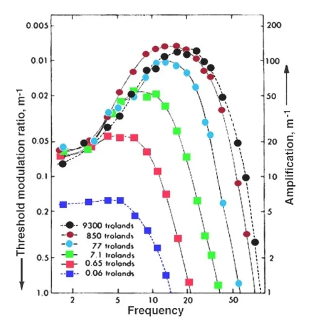
In the scotopic conditions, the stimulus can be detected with less than 1% contrast, and the high temporal frequency cut-off reaches 60-80Hz. Contrary to scotopic vision, in low light level conditions the maximum contrast increases to 20%, whereas the cut-off drops off to about 15Hz. Maximum contrast is required to detect a flicker of high frequencies. This situation changes as the human age increases. Because elderly people are more affected by some eye diseases, they might not hit this range of frequency. For the purpose of checking the eye conditions in terms of temporal contrast sensitivity, the “flicker test” can be applied.
Human contrast sensitivity describes also the difference in colors. Color contrast can be achieved by altering the color elements of hue, saturation lightness, or color order. A visual effect similar to Mach banding and other optical phenomena can be stimulated by appropriate color combination techniques (Drew, 2005). For objects wider, than 0,5 degrees, the chromatic contrast is better distinguishable, than luminance contrast (Pic. 22).
The difference between green and red is spotted easier, than between yellow and blue.
According to psychophysical studies, the contrast is saved in 6 color channels of spatial frequencies by the human eye neurons.
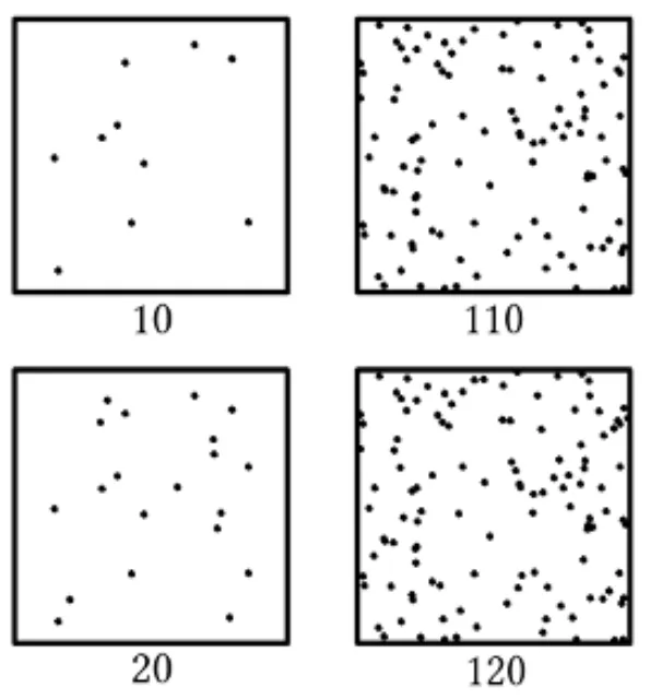
Low contrast sensitivity can be a symptom of poor eye conditions or diseases such as cataracts, glaucoma, or diabetic retinopathy. In this event, the person will be able to see features mostly from the foreground, having trouble with distinguishing objects, located in the background, as per in the image below (Pic. 23).

This is why contrast sensitivity plays a pivotal role in viewing distant objects. The contrast sensitivity can be also degraded by chronic alcoholism. Even a moderate intake of alcohol can alter the ability of the visual system.
4. RELATION OF VISUAL ACUITY WITH CONTRAST SENSITIVITY
Visual acuity determines how clear and sharp is our eye and how our brain can distinguish spatial resolution.
The best way to check visual acuity is the Snellen test. It’s based on the optotypes – the elements that scatter the light ideally. So the person may have a good visual acuity reading the Snellen chart due to high contrast but low contrast sensitivity in day-to-day work. A good sharp eye doesn’t mean, that our contrast sensitivity is good. In the low contrast situation, the visibility will deteriorate. This situation makes contrast sensitivity a better predictor of visual performance than visual acuity.

The Snellen test can be done when the patient stays from the 6m distance to the optotypes in the luminance conditions of 20 footcandles, which correspond to about 215Lx.
Another way to check our sight acuity is the LogMar chart. This chart scores the visual acuity with reference to the logarithm of the minimum angle of resolution. The base of the logarithm is, that when the patient can deal with the details as small as 1 degree, then the visual angle score of logMar is 0. The test of visual acuity can be done also with the pinhole occluder.
5. THE WEBER-FECHNER LAW
The Weber-Fechner law is a combination of Weber law and Fechner law. Both relate to the law of human perception.
The first thing, that comes to mind with Weber’s law is Weber’s contrast. The Weber contrast determines the difference in luminance between an object and the background beyond. The Weber contrast can be both positive (white letters on a darker background) and negative (dark letters on a brighter background). Weber’s contrast is not a part of Weber’s law. Weber’s law only says that the Weber contrast value depends on the object’s size and shape.
Paraphrasing the Weber law, we can say, that when the background is brighter, then we must have a bigger luminance difference between the subject, in order to make it detectable. Weber also says that the biggest contrast sensitivity falls for objects bigger, than 0,2-0,5 degrees with sharp edges.
Weber was able to determine the smallest difference between two weights, that could be detected. It was called the difference threshold. He established also the Just-notable difference (JND) conception – the minimum difference between two stimuli, that can be detected (Salkind, 2010 ). Weber found, that the just notable difference was dependent on the weight of the reference stimulus. For example, the just notable difference between weights 100g and 103g was 3g. For bigger weights, such as 1000g the just notable difference was not 3g, but 30g. On the other hand, imagine, that you are holding a small pebble, which is your reference stimulus. If you place another pebble with a similar size, then you notice the difference (weight increment). The situation will be different when you are holding a heavy rock. Then this smallish pebble won’t make any difference in weight. It places the JND as a constant fraction of the size of the standard stimulus (Salkind, 2010). It means also the Weber contrast remains constant autonomously from the illuminance level. In other words, the law states, that in a change of the stimulus, the just-to-be noticeable difference (JND) is a constant ratio of the initial stimulus (Pic. 25).
The basic prerequisite of the Fechner law states, that different people have different responses to certain stimuli. For instance, the ability to perceive changes in light intensity may be related to how good the vision person is. According to him, the subjective sensation is proportional to the logarithm of the stimulus intensity. Another Fechner law statement applies to the JND, which says, that one JND is perceptually equal to another JND. The perception changes depending on the situation (Pic. 26).

As you can see in the image above, the JND occurs in the middle of the image. The dots shown in the circular path represent the constant of absolute light intensity increments over the background with constant relative light intensity increments. In all cases, the dot placed in the very middle of this row remains practically invisible, despite the background luminance.
Summarizing, the Weber-Fechner Law states, that the perceived intensity is proportional to the logarithm of the stimulus (Portugal, Svaiter, 2010).
6. STEVENS’S BRIGHTNESS LAW
The Stevens considered the grayscale with 10 equally different degrees from white to black (Pic. 27).

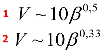
This law refers to achromatic color perception. It states, that the brightness of a static target viewed in the dark is proportional to the target luminance raised to approximately 1/3 power (Rudd, Popa, 2007). The exponent of the brightness law decreases from about 1/2 to about 1/3 as the flash duration is increased from 0.5 to 1000 msec (Stevens, 1964). Stevens discovered the power-law corresponding to the subjective intensity or strength in a real stimulus and the perceived magnitude increase in the sensation caused by the stimulus. Unlike previous Weber-Fechner law, the Stevens Brightness law covers a wide range of sensory comparisons, including zero intensity too. Stevens’s brightness law is derived from Stevens’s power law describing the mechanism in the wider physical sense.
The Stevens brightness law can be described as per the formula below, taking into consideration the white and grey background (Pic. 28).
This formula specifies the power law of the achromatic color scale and is related to the exponent of the brightness law, mentioned above.
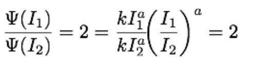
Concluding, Steven’s brightness law establishes the relationship between the stimulus and the perceived value of brightness, which is a subjective impression of luminance. Because the law determines also the difference between the magnitude of the stimulus and the subjective magnitude of the sensation, evoked by the stimulus, we can turn it into the life example of the following situation.
Imagine, that you have got 1 bulb in your room. How much do you need to increase your brightness exactly twice? For sure it won’t be only 1. Following the formula above (Pic. 30), we will need another 4 bulbs to increase the brightness in our room twice.
7. SUMMARY
I didn’t want to bombard you with the complicated formulas, that are omnipresent. I believe this article explains partially the rules of contrast in terms of human vision. There are still things, where an explanation is required. I mostly mean the broadly understood human eye adaptation to sudden brightness changes, while also combining with the light transition phenomenon. The instant luminance shifting is paradoxically a very common thing, that assists us in day-to-day life, for instance when you drive by car during the night. The considerable impact on the contrast sensitivity of our eyes comes from any kind of glare light. Some pieces of information have been presented here, but they still require a decent clarification, which will take place in the future. The mechanism of the human eye combined with its response to light and contrast is the fundamental basis of any observations. Knowing at least the basics of these problems leads to a better understanding of the surrounding world and universe, in which appearance is presented by light wavelengths.
Mariusz Krukar
References:
- Arden G.B., 1978, The importance of measuring contrast sensitivity in case of visual disturbance, (in:) British Journal of Ophthalmology, vol. 62, p.198-209
- Beck J., 1966, Contrast and assimilation with lightness judgments, (in:) Perception and Psychophysics, Vol. 1
- Cao D., et al., 2008, Rod distribution to color perception: linear with rod contrast, (in:) Vision research, v. 48 (26), p. 2586-2592.
- Dowling J.E., 1987, The retina: An Approachable Part of the Brain, Harvard University Press, Cambridge, MA
- Drew S., 2005, Anatomy and physiology of the eye, contrast, contrast sensitivity, luminance perceptions, and psychophysics, Griffith University
- Foley J., et al., 2007, Detection of Gabor patterns of different sizes, shapes, phases, and eccentricities, (in:) Vision research, v. 47(1), p. 85-107
- Gilchirst A.L., 1994, Lightness, Brightness and Transparency, Lawrence Elbaum Associates Publishers, Hove, UK
- Leuween C., Paramei G. V., 2016, Color and form perceptions: straddling the boundary, (in:) Frontiers in psychology, vol. 7
- Osram Sylvania Corporation, 2000, Lumens and mesopic vision, Application Note FAQ0016-0297
- Peli G. D., 2013, Measuring contrast sensitivity, (in:) Vision research, v. 20 (90), p. 10-14.
- Pegoraro V., 2017, Handbook of Digital Image Synthesis: Scientific Foundation of Rendering, CRC Press, Boca Raton FL.
- Portugal R.D., Svaiter B.F., 2010, Weber-Fechner Law and the Optimality of the Logarithmic scale, (in:) Minds and Machines, vol. 21, i.1, p. 73-81.
- Rovamo J., Fransilla R., Nasanen R., 1992, Contrast sensitivity as a function of spatial frequency, viewing distance and eccentricity with and without spatial noise, (in:) Vision research, v. 32, i.4 , p.631-637.
- Rudd M., Popa D., 2007, Stevens’s brightness law, contrast gain control and edge integration in achromatic color perception: A unified model (in:) Journal of the Optical Society of America, vol. 24 (9), p.2766-82.
- Salkind N.J., 2010, Encyclopedia of Research Design, vol. 1, Sage, London, New Delhi, Singapore, Washington
- Schubert E. F., 2012, Light-emitting diodes, Cambridge University Press, Cambridge.
- Stevens S.S., 1964, Duration, luminance and the brightness exponent, (in:) Perception & Psychophysics, vol.1/66 66-100.
- Valberg A., 2005, Light Vision Color, John Wiley & Sons Ltd
- Watson A.B., et al., 2016, The pyramid of visibility, (in:) Society of Image Science and Technology.
- Westheimer G., 1981, Visual Hyperaquity, (in.) Autrum, et al., Progress in sensory physiology, Springer-Verlag, Berlin, Heidelberg, New York
- Wooten B.R., et al., 2010, A practical method of measuring the human temporal contrast sensitivity function, (in:) Biomet Opt Express, vol. 1 (1), p.47-58.
Links:
- https://www.telescope-optics.net/eye_intensity_response.htm
- https://telescope-optics.net/eye_spectral_response.html
- Standard luminosity function table values and explanation
- Luminous efficiency
- The sensitivity of the human eye
- Wavelength to the colour relationship.
- Night vision
- Colour vision
- Color perception and chromaticity
- Color-Contrast
- The 7 different kinds of contrast
- Luminance contrast
- What do we mean by color contrast?
- Colour contrast and color assimilation
- Contrast sensitivity testing
- Luminance contrast
- Contrast sensitivity
- The contrast sensitivity function
- The contrast sensitivity function (CSF)
- Contrast sensitivity – tests
- Sine grades & spatial frequency channels
- What is the contrast modulation?
- Retinal illuminance
- The organization of the retina and visual system
- Visual acuity – criteria
- Temporal sensitivity and mean luminance
- Threshold contrast versus spatial frequency
- Webvision: Visual acuity
- Visual acuity and contrast sensitivity
- Low vision tutorial
- Weber-Fechner law
- What is Weber’s law.
- Stevens Power Law
Wiki:
- Absolute_threshold
- Assimilation_and_contrast_effects
- Bezold_effect
- Brightness
- Just-noticeable_difference
- LogMAR_chart
- Luminosity_function
- Luminous_intensity
- McCollough_effect
- Optical_transfer_function
- Perception
- Photopigment
- Pinhole_occluder
- Pupillary_light_reflex
- Radiant_flux
- Snellen_chart
- Spatial_frequency
- Spectral_sensitivity
- Stevens%27s_power_law
- Troland
- Visual_acuity
- Visual_perception
- Weber-Fechner law
Forums:
1. How-does-the-dynamic-range-of-the-human-eye-compare-to-that-of-digital-cameras
2. https://physics.stackexchange.com/questions/3145/sensitivity-of-eye
3. https://www.quora.com/What-is-the-most-visible-color-when-using-the-human-eye-to-see
4. https://www.quora.com/What-is-the-difference-between-Contrast-and-Brightness
5. https://www.quora.com/Where-is-the-area-of-greatest-visual-acuity
Youtube:
Read also: