
Choropleth map in QGIS based on the MS Excel data
This time I would like to present an excellent way of making the simple choropleth map in QGIS, based on MS Excel data. Occasionally you will be acquainted with some tricks, which help you to understand how to plot the Excel data to your QGIS map correctly.
There are 2 primary sets of data you need for creating the choropleth map in QGIS. The major one is the stuff you want to visualize, although it cannot be accomplished without the template file, which is the second bit of this challenge.
Let’s get started and see all the steps required for finishing this exercise.
1. As the very first step I would consider making a brief analysis of our Excel data and investigate, which types of areas it applies to.
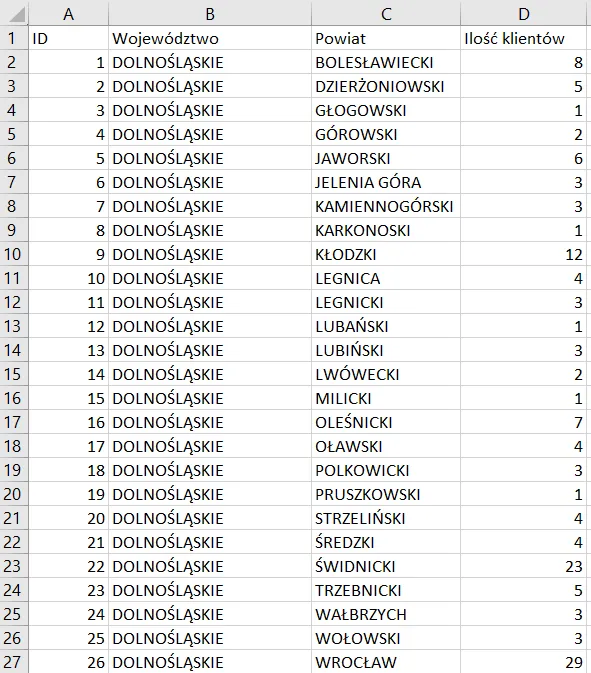
Pic. 1 Our sample Excel data with a breakdown of Polish administrative units, which represents the specified number of clients.
For instance, the data above represents the number of clients (column D) with the breakdown of Polish administrative units, which are counties (Powiat) bounded by voivodships (Województwo). Though we know the type of administrative unit, to which our data refer, we need the template file, which will include exactly the same level of administrative division.
2. The template files (vector layers) with administrative units can be downloaded from various services, which list can be found here. In the case of our situation, the best will be to use the Polish service for this sort of data. By selecting the national data source of template files we can make sure, that all administrative borders are correct, unlike some general, worldwide sources, which might be not enough accurate. Let’s download the .zip file with counties (powiaty) and unzip its content later (Pic. 2).
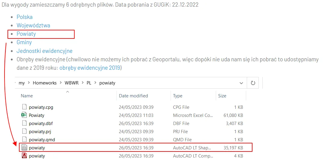
Pic. 2 Downloading the template file for counties (powiaty) from GIS-support.pl. After unzipping the user can see the shapefile (the second biggest one), which must be loaded to the QGIS project.
Next, it won’t be difficult to see two large files. The upper one is the .csv file including WKT geometry and the county name. This file can be loaded to QGIS the same as the .shp file, which can be used alternatively. Honestly, in my point of view, much smarter will be to use the .shp file instead, because the database is more transparent there.
3. Load the .shp file to your QGIS project by dragging it to the map canvas (the fastest way) or Main Toolbar -> Layer -> Add Layer -> Add Vector Layer, where you can choose your file (Vector Dataset(s)) in the Source section.
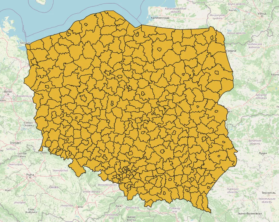
Pic. 3 The county (powiaty) administrative units loaded to the QGIS project.
The template file in QGIS should look as above (Pic.3). Don’t worry about the styling now, as the data must be added first. At this moment our first part of the exercise is done.
4. Open the attribute table of your template file and find the column, which corresponds to the name of the counties (powiats) (Pic. 4). Optionally you can sort them increasingly, from lowest to highest (from A to Z) value but it’s not necessary.
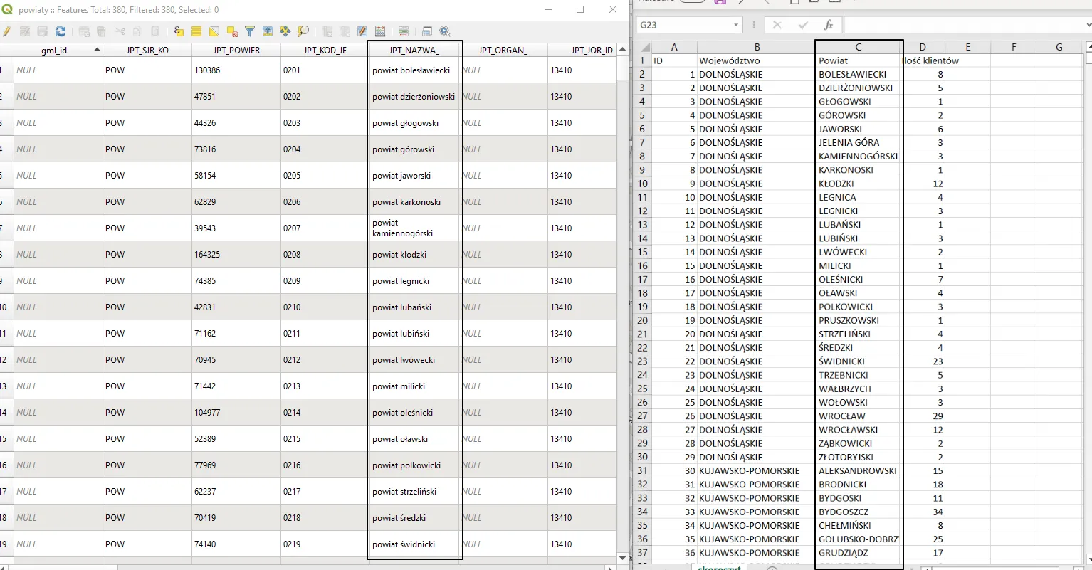
Pic. 4 The attribute table column, which corresponds to the names of administrative units and its counterpart column in MS Excel.
More important is making these 2 columns exactly the same in both sources. So far, despite the same content they vary. The QGIS column has a different name and the content isn’t in uppercase characters. With these circumstances, we can’t go to the next step.
5. The Excel data can be left as it is, although we have to save the file in the .csv format, which is readable by QGIS.
6. By making two of the same columns match we need to create another one in our data attribute table, with exactly the same name as appears in our .csv file (Pic. 5).
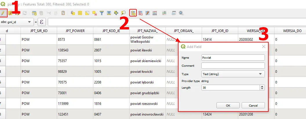
Pic. 5 Creating the new column in the QGIS attribute table, which would be exactly the same as in the .csv file, where: 1 – making the layer active; 2 – creating the new column (field); 3 – The Add Field options.
The new field (column) should be a string with a length of up to 30 characters just in case. Once created, it will appear at the very end of our attribute table.
7. Use the Expression field at the top of your attribute table and apply it to your newly created field. There are two ways of making this field exactly the same as in the .csv file.
So far we were based on the JPT_NAZWA_ field, although by browsing a multitude of other fields down to the end we can find another one called POWIAT, which includes the final result we want. In this case, the expression for the newly created column should be really straightforward, because you just need to type POWIAT and press the “Update All” button. In other cases, the issue is slightly more difficult, as we need to provide the correct formula in the expression tab (Pic. 6).
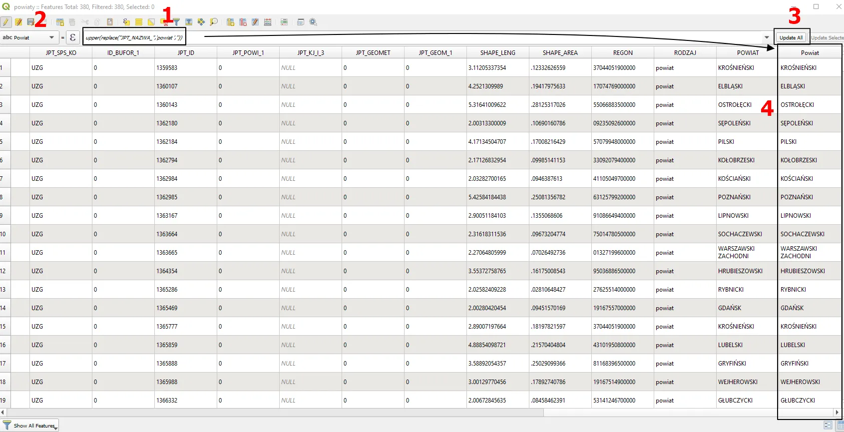
Pic. 6 Applying bulk expression in the newly created field, where: 1 – the formula in the Expression tab; 2 – selection of the proper field; 3 – The “Update all” option.
The formula should look like this:
upper(replace("JPT_NAZWA_",'powiat ',''))
which translated to the versatile usage will look as follows:
upper(replace("column name",'text_old','text_new'))
We are replacing (1) the existing text + 1 space (‘powiat ‘) with nothing (”). Everything will be in capitals, as included in the upper function.
The results you can see on your right (Pic. 6). They’re exactly the same as the values in the adjacent column.
There is also a third way of making these 2 columns exactly the same. When you are uncomfortable with providing the expressions, go to your .csv file and make the column name in capital letters. That will save a lot of time for you.
8. Add your .csv file to QGIS. Use Main Toolbar -> Layer -> Add Layer -> Add delimited text layer. QGIS should detect geometry automatically, although in our case we don’t have coordinates provided. Therefore as the default option the “No geometry(attribute only table)” is selected (Pic. 7).
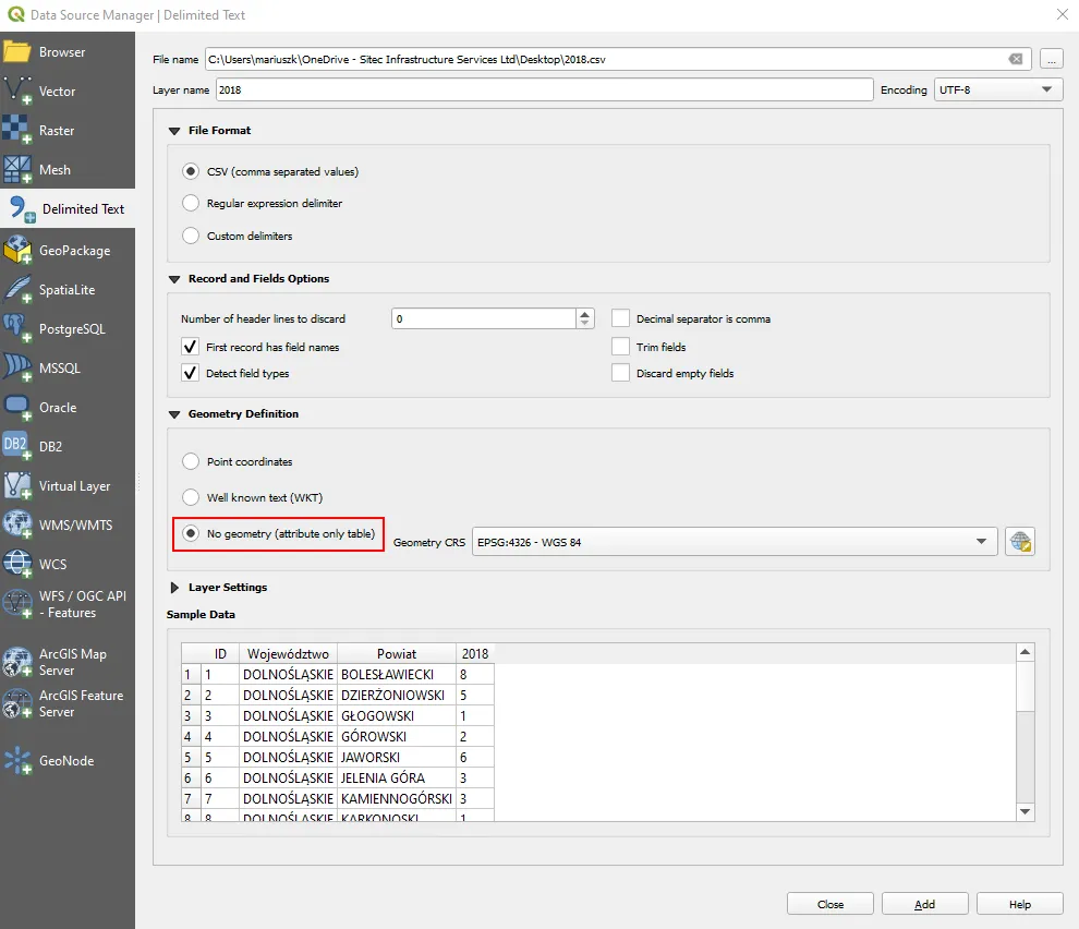
Pic. 7 Loading the .csv data without geometry to QGIS.
Next, the table-looking signature should appear in the QGIS layer panel. We have just the attribute table now with at least one field matching the attribute table of our template shapefile (Pic. 8).
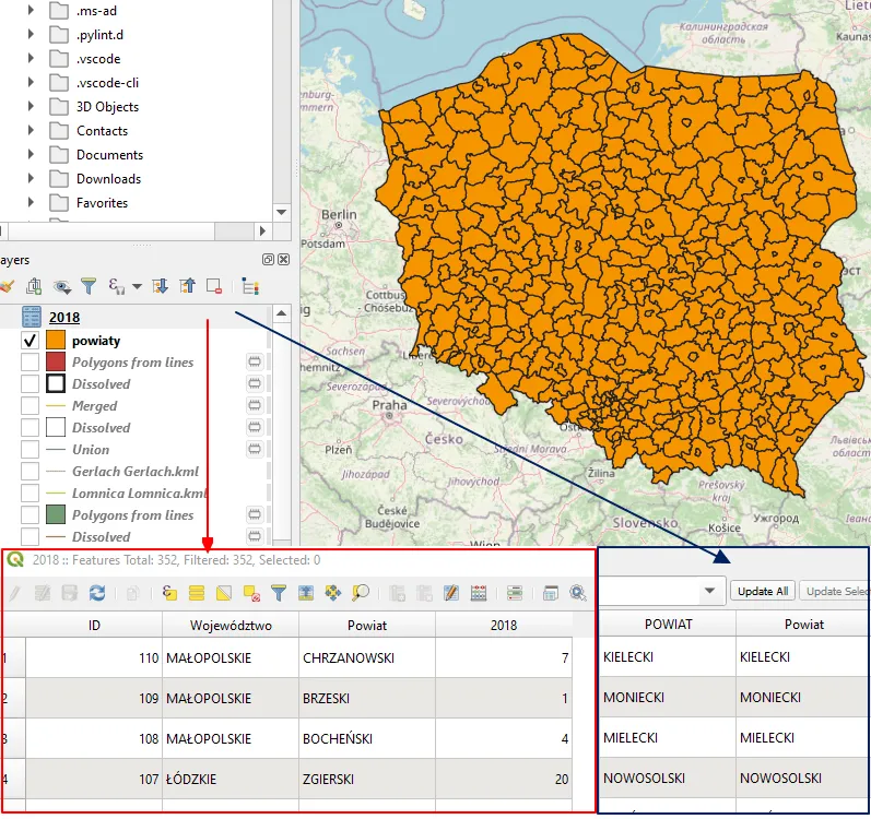
Pic. 8 The .csv data without geometry loaded. The comparison between the two attribute tables is below.
9. Right-click on your template shapefile in the Layers panel and navigate to Properties -> Joins.
When you are there, click the green “+” symbol and define your Vector Join conditions (Pic. 9).
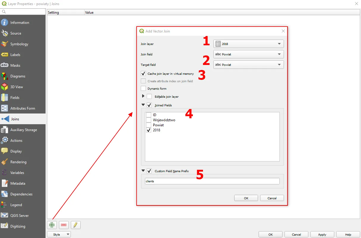
Pic. 9 Joining .csv data with the vector layer file in QGIS, where: 1 – the “Join layer” selection (our .csv file); 2 – Matching fields (they must represent the same unique values!); 3 – the “Cache join layer in virtual memory” option, which is very important, as it retains the joined data in attribute table; 4 – The “Joined fields” choice; 5 – The “Custom Field Name Prefix” option.
When the “Add Vector Join” window is open make sure, that your selection is OK. In the Join layer, you must include the source of the join, which in your case will be the .csv file with the data (1). Next, you have to select these fields, which match each other exactly with the name as well as the content with unique values(2)! Another important, although default switched-on option is caching the joined fields. Please keep this option available, because otherwise, your joined fields won’t appear in the attribute table. In the “Joined fields” you can specify the field, which includes exactly the data you are after. The last element is the prefix, which can be provided or not. As the default, the name of your .csv file is considered.
After closing the window, you should see the recent join in the “Joins” list (Pic. 10).
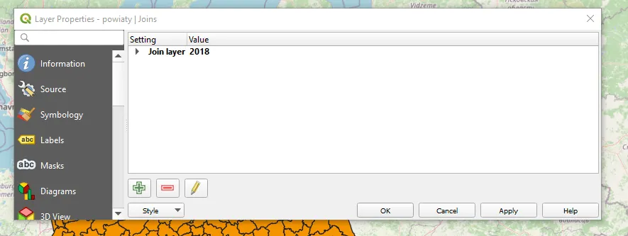
Pic. 10 The list of joins in QGIS.
10. Check the attribute table of your template file (vector layer). When everything is alright, you should see the new column joined with data coming from the .csv file (Pic. 11).
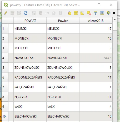
Pic. 11. Joined fields in the data attribute table.
This new field is simply cached from the joining process. That’s why the selection of “Cache join layer in virtual memory” is very important. Basically, you can carry on with the current file, albeit I would advise you to resave this vector layer in order to integrate all the data.
11. You can do it by right-clicking on your shapefile layer Export -> Save feature as…
Once the Save pop-up appears make sure, that the file name & format is correct. Usually, the CRS projection is invalid, when the layer has been joined just with table data before. You can change it to the system appropriate for your project (the default is EPSG:4326 – WGS 84) (1).
The last step is making sure what certain fields you need. The template files usually come with a multitude of attribute fields, which can’t be used anywhere. Therefore in order to reduce the file weight it’s good to remove them, which is the easiest when exporting. By hitting the “Deselect All” button (2), all the fields are switched off. You are selecting just the last two, which are needed for the visualization (Pic. 12).
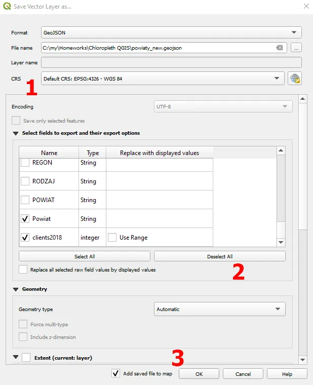
Pic. 12 Exporting layer in QGIS to the example GIS format, where: 1 – selecting correct CRS; 2 – deselecting all fields (and selecting just the most important ones); 3 – confirming by clicking the “OK” button when everything is alright.
12. Make sure, that your data column doesn’t include NULL values. Any values such as this can be easily replaced with 0 as per the image below (Pic. 13). The NULL value will make the given administrative unit not visible on the map as it doesn’t fit the graduated styling class.
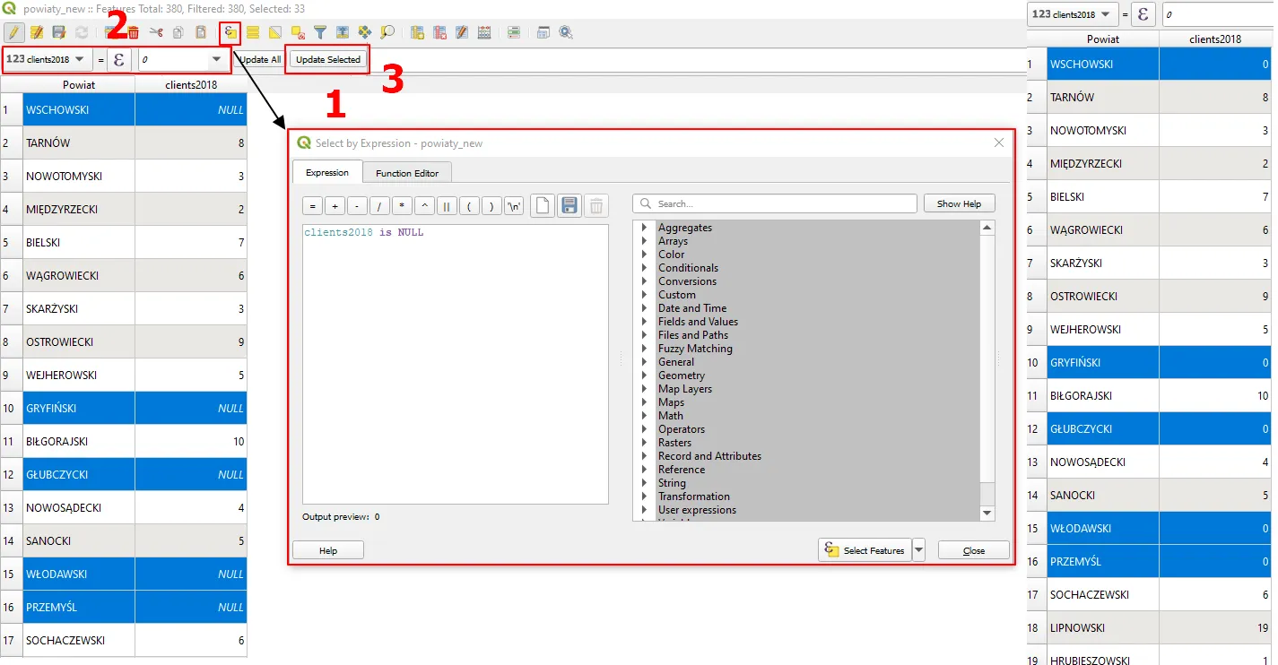
Pic. 13 Replacing NULL values with 0 in the QGIS attribute table, where: 1 – selecting by expression; 2 – providing the 0 value in the expression box at the top; 3 – updating selected values by pressing the “Update selected” button.
First of all, you should select all these values, which can be done by this simple expression:
layer is NULL
and next, in the expression tab above the attribute table, you can type just 0 and hit the “Update selected” button. Work done.
Alternatively, it can be done in the next step, where instead of the column name in our Value (Pic. 12)(2) you will provide the following condition:
CASE WHEN
"clients2018" IS NULL THEN 0
ELSE
"clients2018"
END
13. Style your new layer and make it look like the choropleth map. Right-click on the layer -> Properties -> Symbology
Next, at the very top, you can see the default type of styling – “Single symbol“. For our purpose, the “Graduated” styling is required (1). Then the mandatory step is defining the Value (field) on which our styling will be based (Pic. 12)(2).
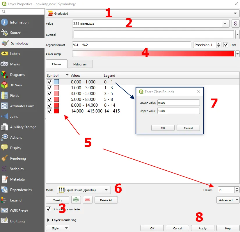
Pic. 14 Graduated styling for choropleth map in QGIS, where: 1 – Selection of the styling type; 2 – Selecting the value (field) on which the styling will be based; 3 – Autoclassifying the style classes (the “Classify” button); 4 – Defining color ramp; 5 – Defining the total number of classes; 6 – Selecting the counting mode; 7 – Manual changes of the class bounds; 8 – Confirming our settings (the “Apply” button).
Next, QGIS can classify all the classes automatically for you. You just need to hit the “Classify” button. Before or after that you can play with the color ramp (4). As the default is from white to red.
The number of classes (5) is just proposed, but we can always change it the same as the way these classes should be counted (6). If you are not satisfied with the class bounds, they can be also changed by double-clicking on the given one and providing the range you want (7). When you are fully satisfied, just press the “Apply” button and wait for the effect.
14. Our choropleth map is ready (Pic. 15). It’s not finished yet, as you probably need it in the printable version.
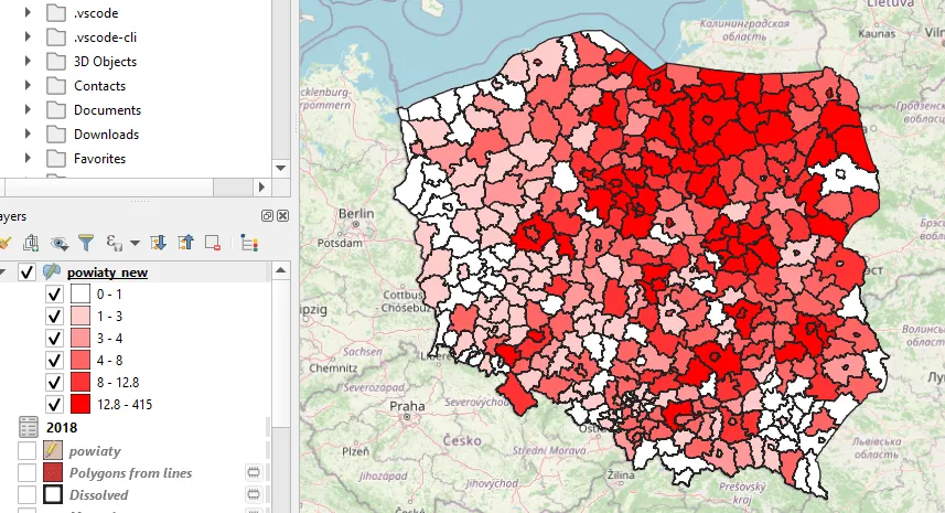
Pic. 15 Chloropleth map ready in QGIS project.
15. The last step is customizing our results in the print layout. Firstly, we can take down the OpenStreetMap XYZ layer and have just our data displayed. Next, navigate to Main Toolbar -> Project -> New Print Layout. Create the New Print Layout with the name you want and wait until the layout window opens.
I guess you don’t need to worry about the paper size. Just load the map (1) and adjust the scale slightly (2) upon fitting with the paper. Next load the legend (3) and make some minor changes there. Change the legend title (4), turn off Autoupdates (5), and by using the red “–” sign delete the layers that don’t belong to your final task. I believe you should have your QGIS project empty, but just in case you will know how to do it. In the last step (7) you can change the name of the remaining layer by double-clicking (Pic. 16).
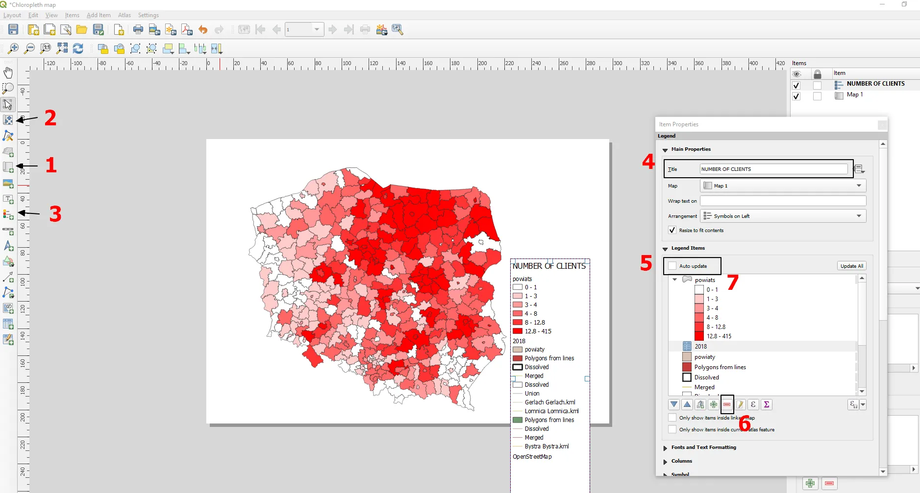
Pic. 17 Working with the print layout in QGIS where: 1 – Add map from the project; 2 – Move item content (including zoom); 3 – Add legend; 4 – Change legend name; 5 – Turn off “Auto update” of the legend; 6 – remove unnecessary layers; 7 – change the name of the final layer (optionally).
If you don’t have the popup legend window visible, then right-click on the legend item in the box on your right.
16. Your final map should look pretty much like below (Pic. 18).
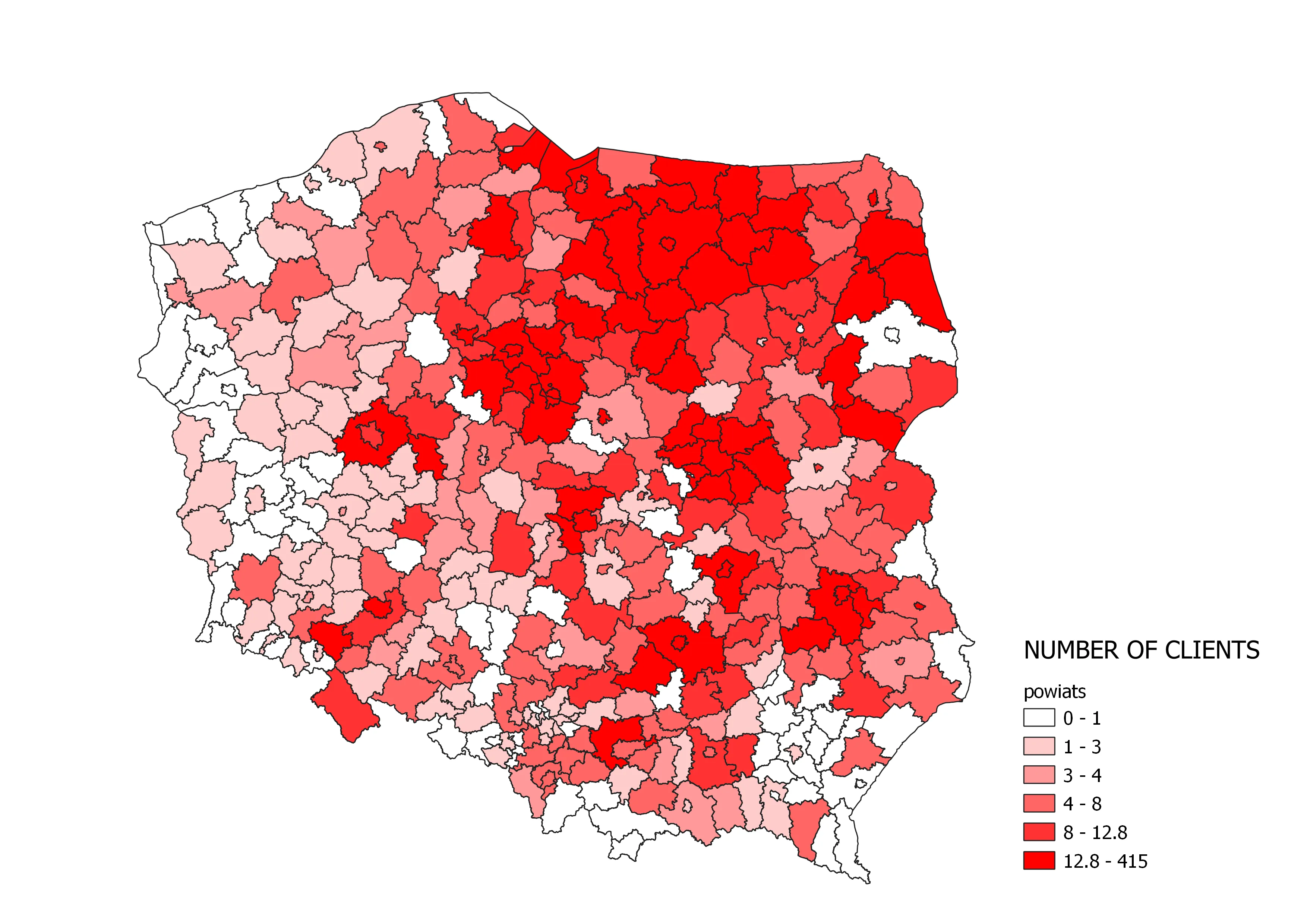
Pic. 18 The final choropleth map in QGIS. Click to enlarge.
If the information about the print layout isn’t enough for you, I would recommend you to read this article, where this matter was explained well. You can also browse this documentation.
Mariusz Krukar
Links:
- https://gis-support.pl/baza-wiedzy-2/dane-do-pobrania/granice-administracyjne/
- https://docs.qgis.org/3.4/en/docs/training_manual/map_composer/map_composer.html
Forums:
- https://gis.stackexchange.com/questions/336826/qgis-feature-form-force-attribute-to-save-as-uppercase
- https://gis.stackexchange.com/questions/78659/using-replace-string-function-in-qgis-field-calculator
- https://gis.stackexchange.com/questions/251537/alternatives-to-joining-attributes-in-qgis
- https://gis.stackexchange.com/questions/79627/replacing-all-null-values-from-attribute-table-with-zeros-in-qgis
Youtube:
Usually I do not read article on blogs however I would like to say that this writeup very compelled me to take a look at and do it Your writing style has been amazed me Thank you very nice article
Can you be more specific about the content of your article? After reading it, I still have some doubts. Hope you can help me.
What doubts do you have exactly? Happy to help you